the sizzle standard
The Problem
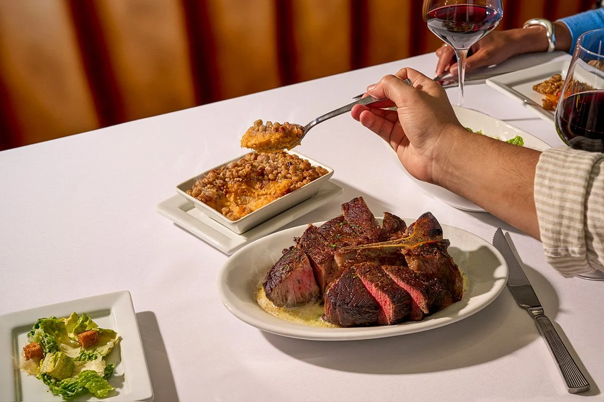
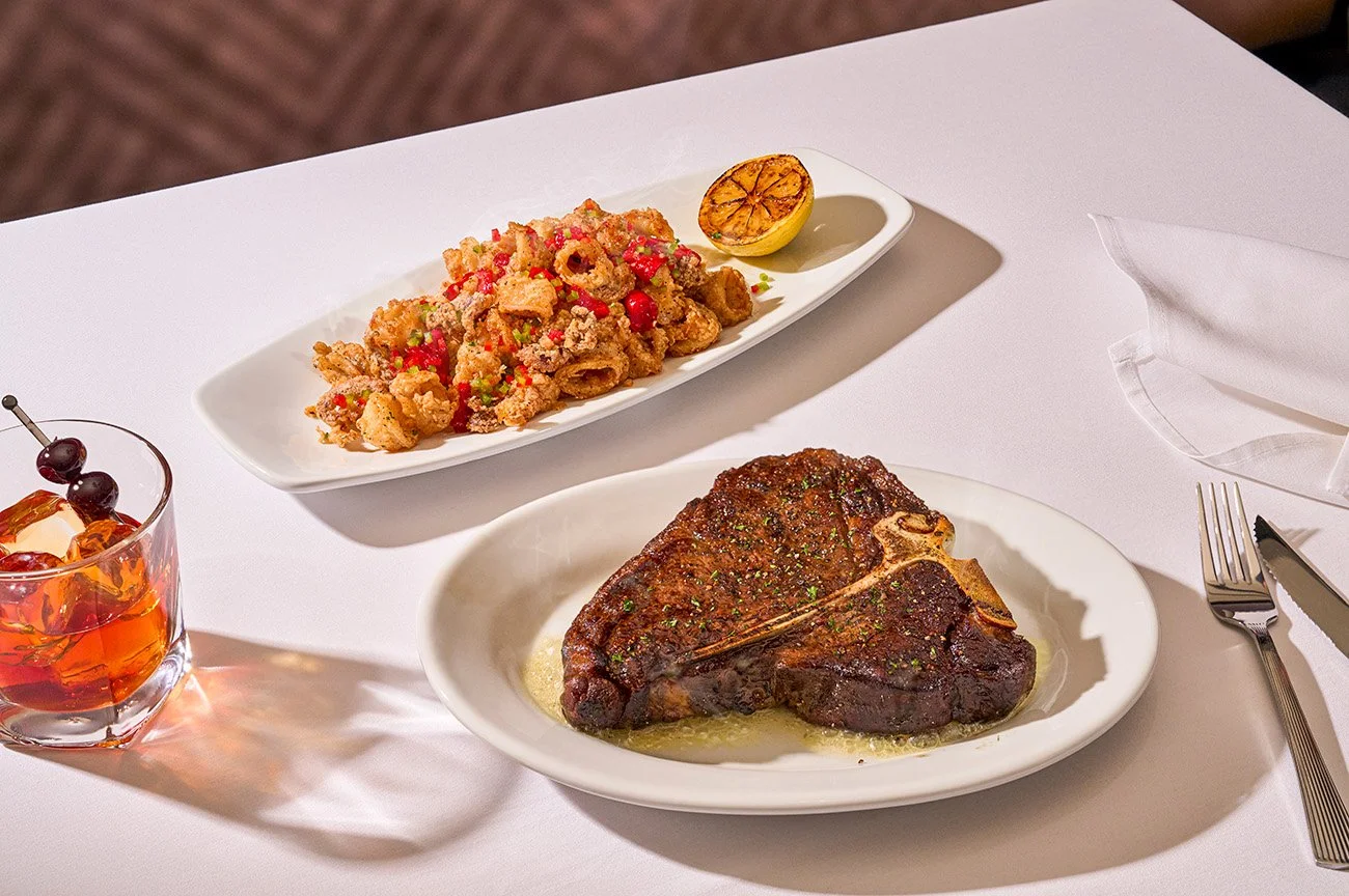
Ruth’s Chris had the reputation for being the go-to spot for big, formal occasions, but the brand leaned too hard into that white-tablecloth image. The personality behind the name—Ruth Fertel’s grit, warmth, and down-to-earth story—was getting lost. It didn’t feel like a place you could enjoy on a regular night, and the brand voice and visuals weren’t doing much to change that.
The Solution
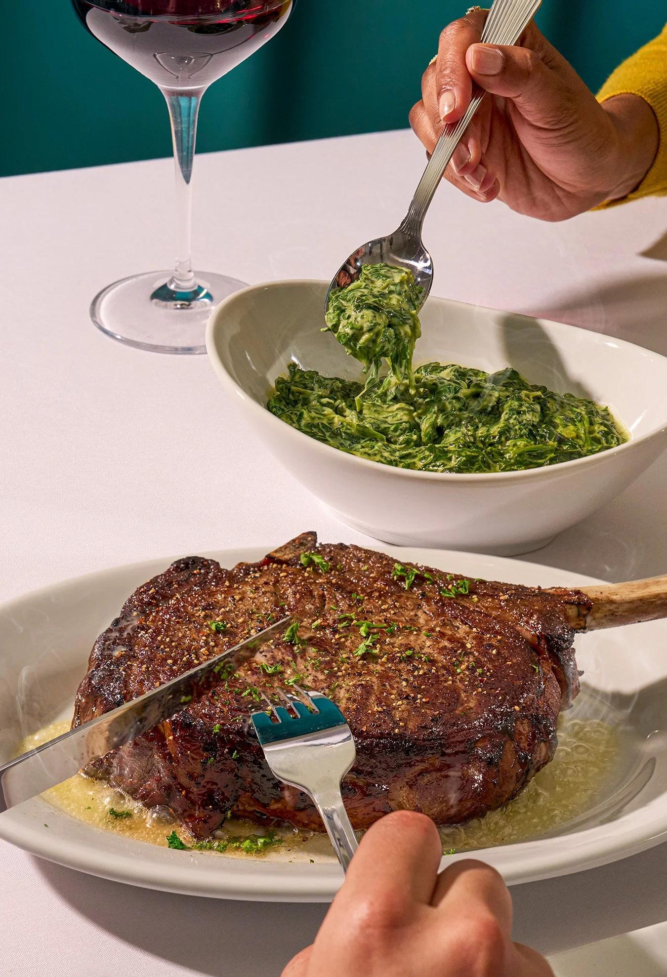
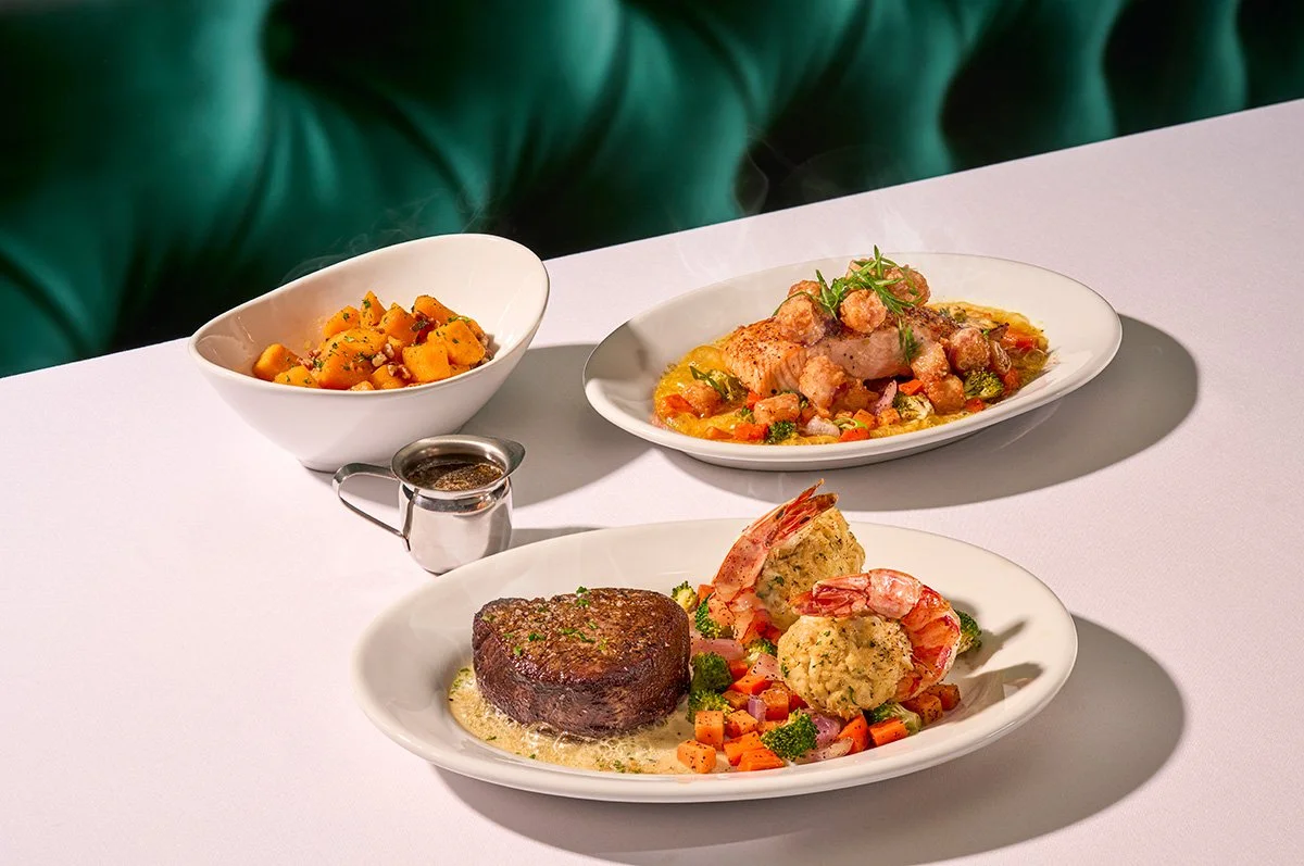
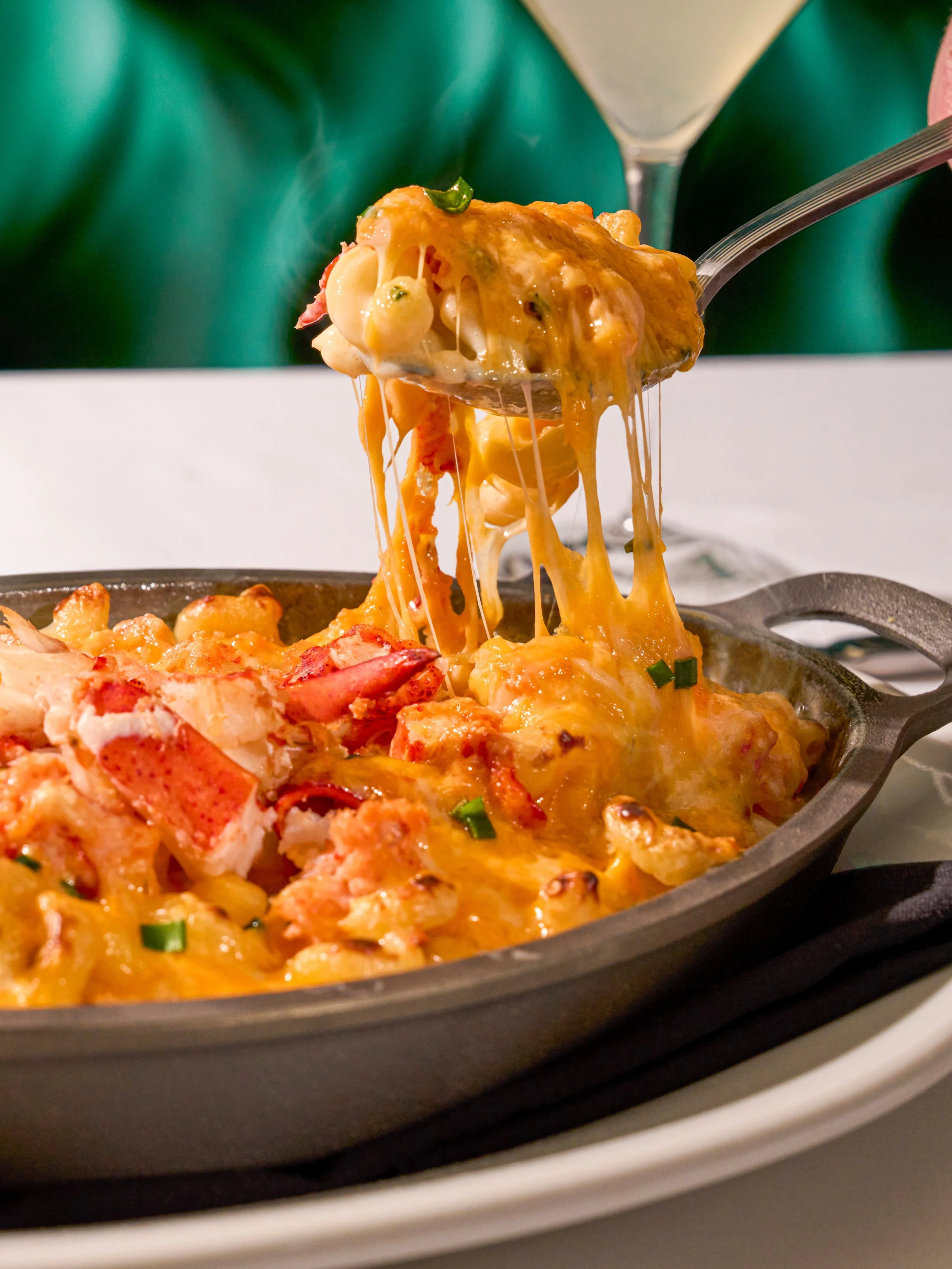
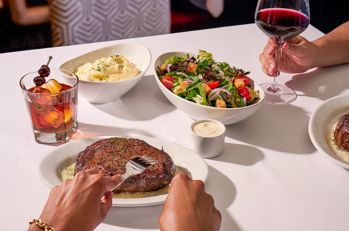
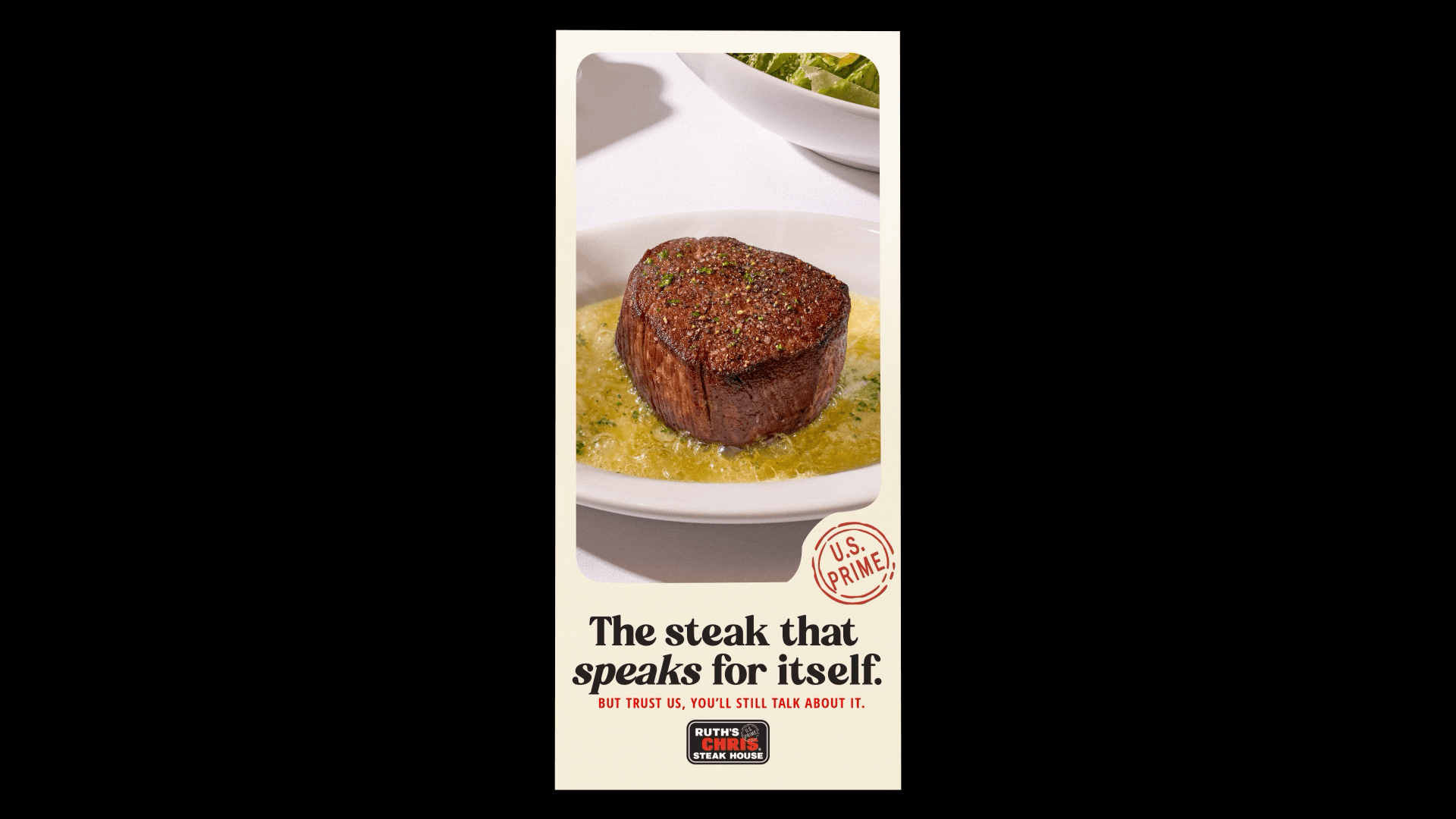
The goal was to bring more of Ruth herself into the brand, making it feel real, grounded, and welcoming. We reworked the tone to feel confident without being arrogant, and gave the visuals more life: warmer lighting, richer textures, and those small sensory details (like the sound of sizzling butter) that bring people back. The result is a brand that still shows up for the big moments but feels just as right for a casual dinner on a Wednesday.