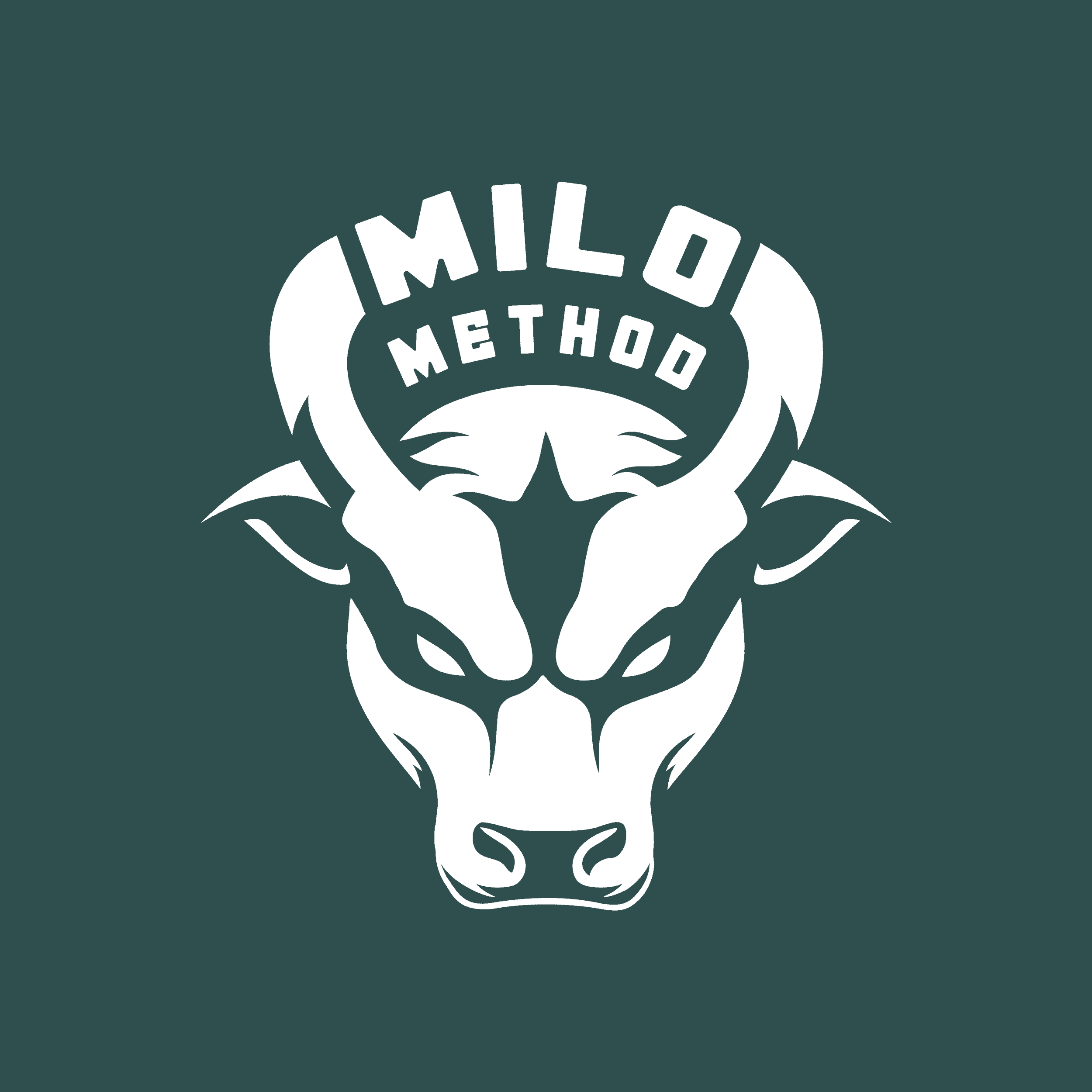
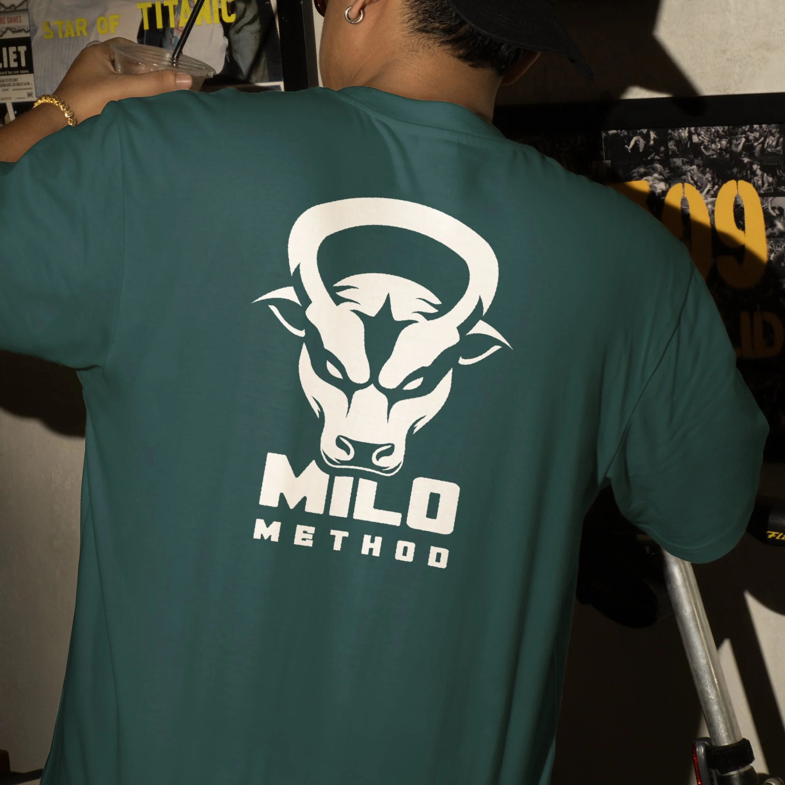
brand identity built pound by pound
Millow Method is a personal training brand rooted in the mindset of “Pound by pound,” emphasizing simplicity, strength, grit, and reliability. While the brand had a strong philosophy, it lacked a visual foundation to match. The goal of this project was to build a complete identity that reflected both the trainer’s personal style and the disciplined, results-driven approach behind the method. The ox was chosen as a central symbol, representing resilience and power across a range of training styles, and serving as a unique and personal emblem for the brand.
The final identity takes a bold yet minimal approach, featuring a logo mark that merges a kettlebell with an ox head to capture both grit and clarity. The visual system, including a tailored color palette and supporting elements, reinforces the brand’s philosophy while standing out in a saturated fitness market. The result brought Millow Method from concept to reality, giving the client a tangible platform to grow their presence and confidently compete with top-tier trainers.