Designing the Identity for an Unknown Brand That Was Right in Front of Us
I co-founded Omni with my good friend and teammate, Blake, after years of feeling like the volleyball world just didn’t represent us. We were playing in top-level tournaments, training like the professionals, but none of the brands in the space felt aligned with who we were. Everything was loud, flashy, performative. That didn’t speak to us. We’re not here to stand out. We’re here to show up.
Blake said it one night on a phone: “What if we made a brand we’d actually wear?” That hit home, so I got to work.
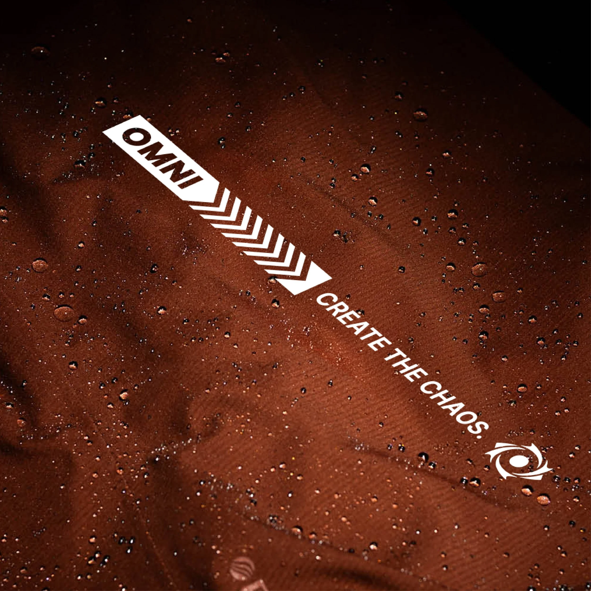
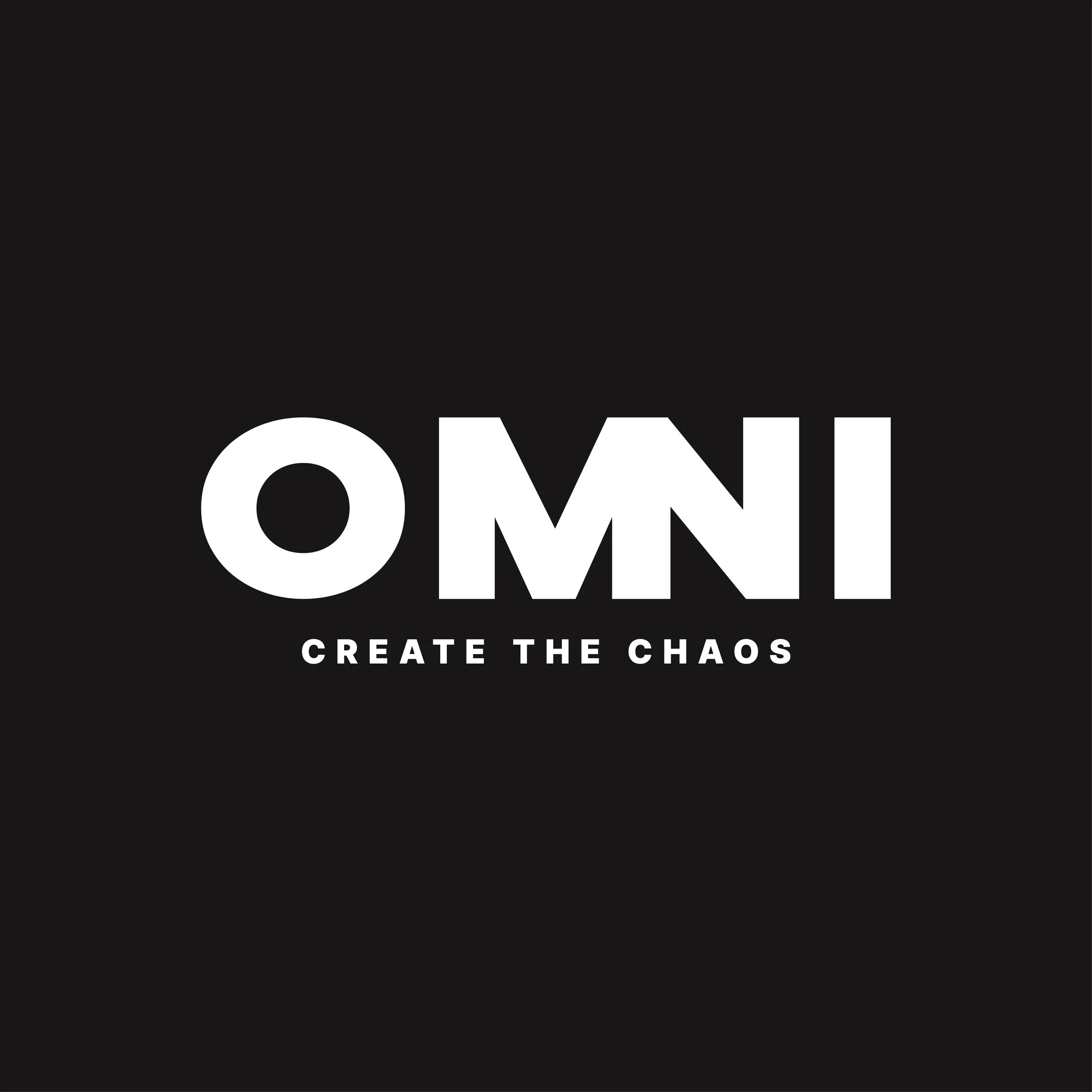
What followed was two months of late nights. Sketching. Researching. Storytelling. Brainstorming. I kept coming back to one idea: hidden in plain sight. A brand that blends in, but shifts everything when it moves. Bingo. That’s where Omni came from. An extension of who we were. The name, the concept, the design, it all stemmed from that mindset. Like a black hole. Quiet, powerful, disruptive.
Omni was never about being seen. It was about building something for the athletes who don’t need attention to prove their worth. The ones who grind in silence, lead with discipline, and create their own chaos, so no one else can.

The Brand built from Instinct
When I sat down to build Omni’s visual identity, the goal wasn’t to create a brand that stood out in a loud way—it was to build one that couldn’t be ignored.
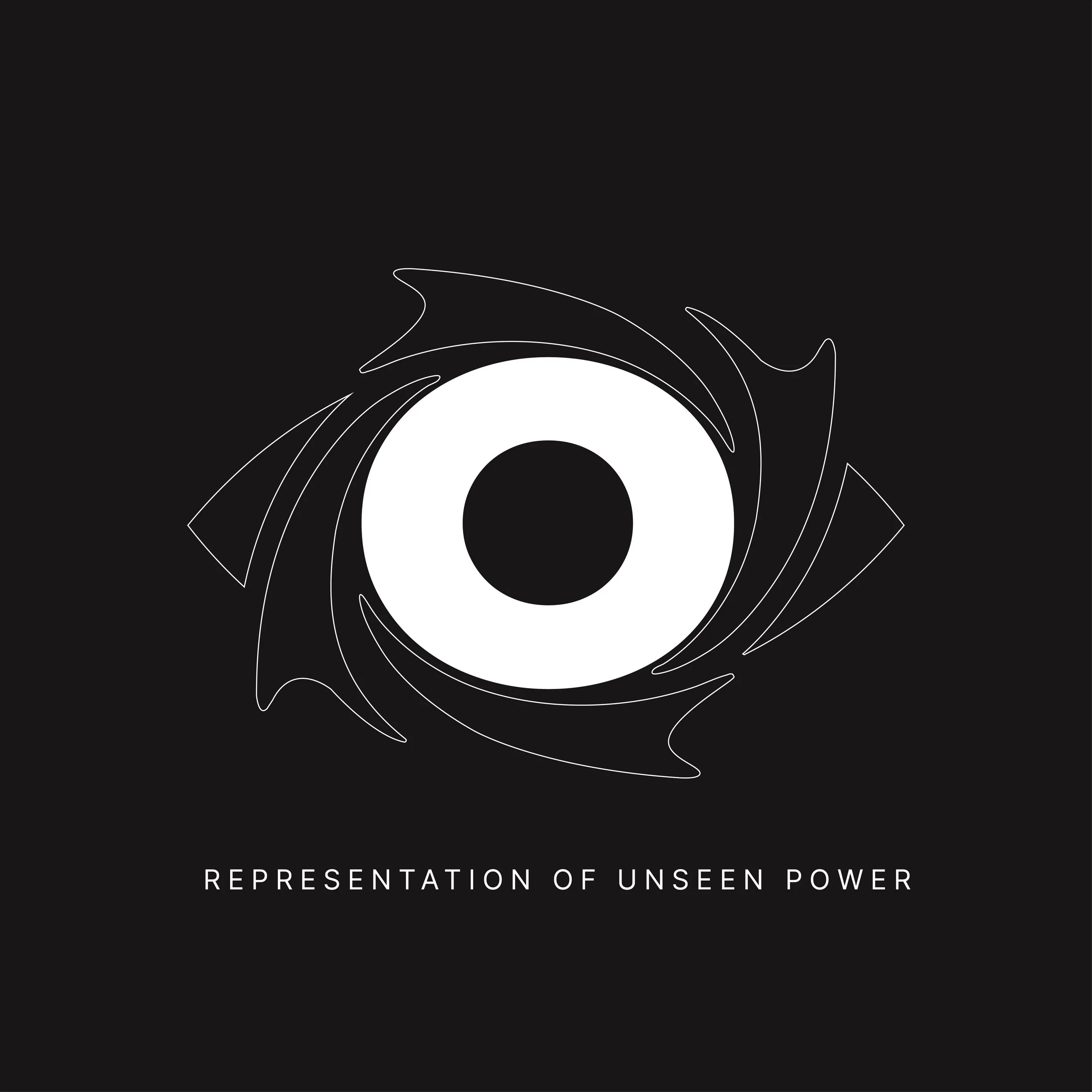
The concept was always rooted in subtle disruption. Omni had to feel like something bigger than a logo or a clothing line. It had to represent a mindset. I started with the idea of dark matter—something unseen, but powerful enough to move everything around it. That became the foundation for how the brand would carry itself: minimal, grounded, and controlled—but still magnetic.
The wordmark and logomark had to hold that same tension. Sleek, bold, and legible. A balance of sophistication and grit. Something that could stand on its own in any environment—from a volleyball court to a mountain trail to an everyday gym grind.
The color palette is where the tone really settled in. Black and white became the core—timeless, focused, and disciplined. Then came the stellar accent. Not just for aesthetics, but to give Omni that one subtle edge that feels signature without trying too hard. A shot of energy in a controlled system.
Everything in the identity was built to reflect the people the brand represents: focused, versatile, and unshakably consistent. The ones who train when no one’s watching. The ones who create their own chaos and control the outcome.
This wasn’t just another apparel project. It was about designing something that could live across every setting—without ever needing to explain itself.


visual identity coming to life
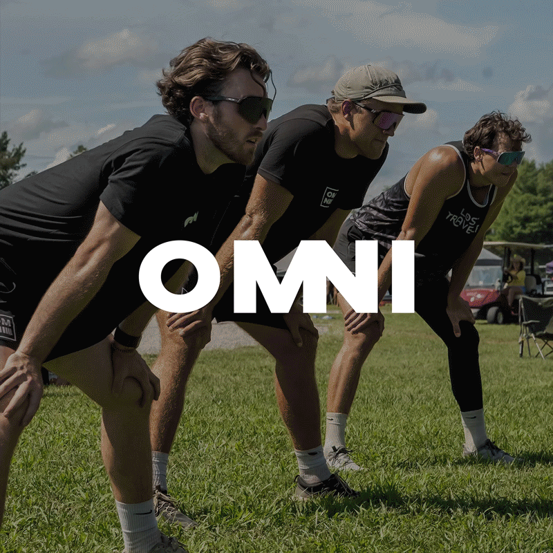
Once the brand was locked in, the next challenge was bringing it to life through the gear. The stuff people actually wear. Not just to work out in, but to travel in, hang in, live in.
The goal was never to be loud. Omni was always meant to feel clean, confident, and wearable in any setting, without screaming for attention. I didn’t want oversized graphics or trendy placements. I wanted every piece to look and feel like it belonged in your daily rotation, no matter who you are or what you’re training for.
We leaned into simplicity on purpose. Minimal logos, clean layouts, and color choices that felt grounded. The black and white base gave us structure and discipline. Any accent had to earn its spot to add value, not just color.
This is the point where the brand started to breathe. When you could hold it, wear it, move in it. Every garment became an extension of the mindset we built Omni on which was to show up, stay sharp, keep moving.