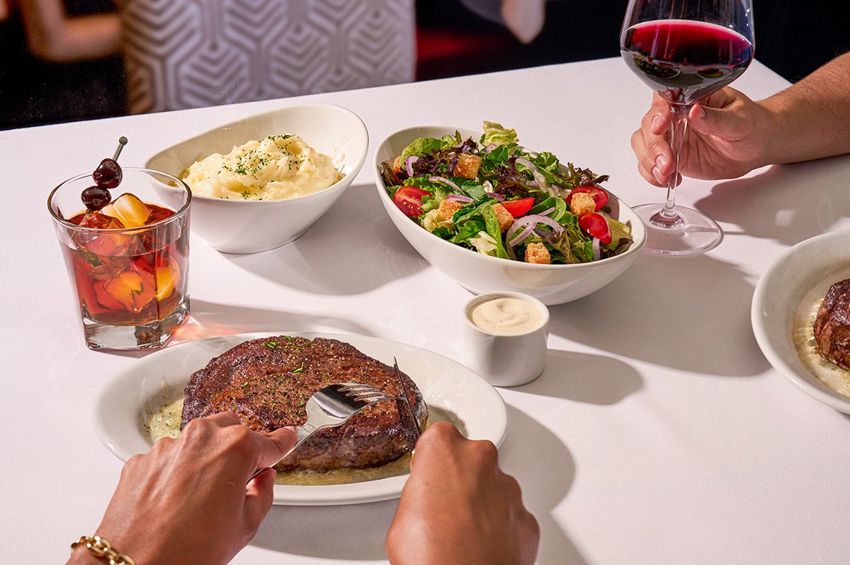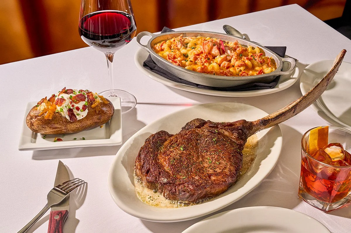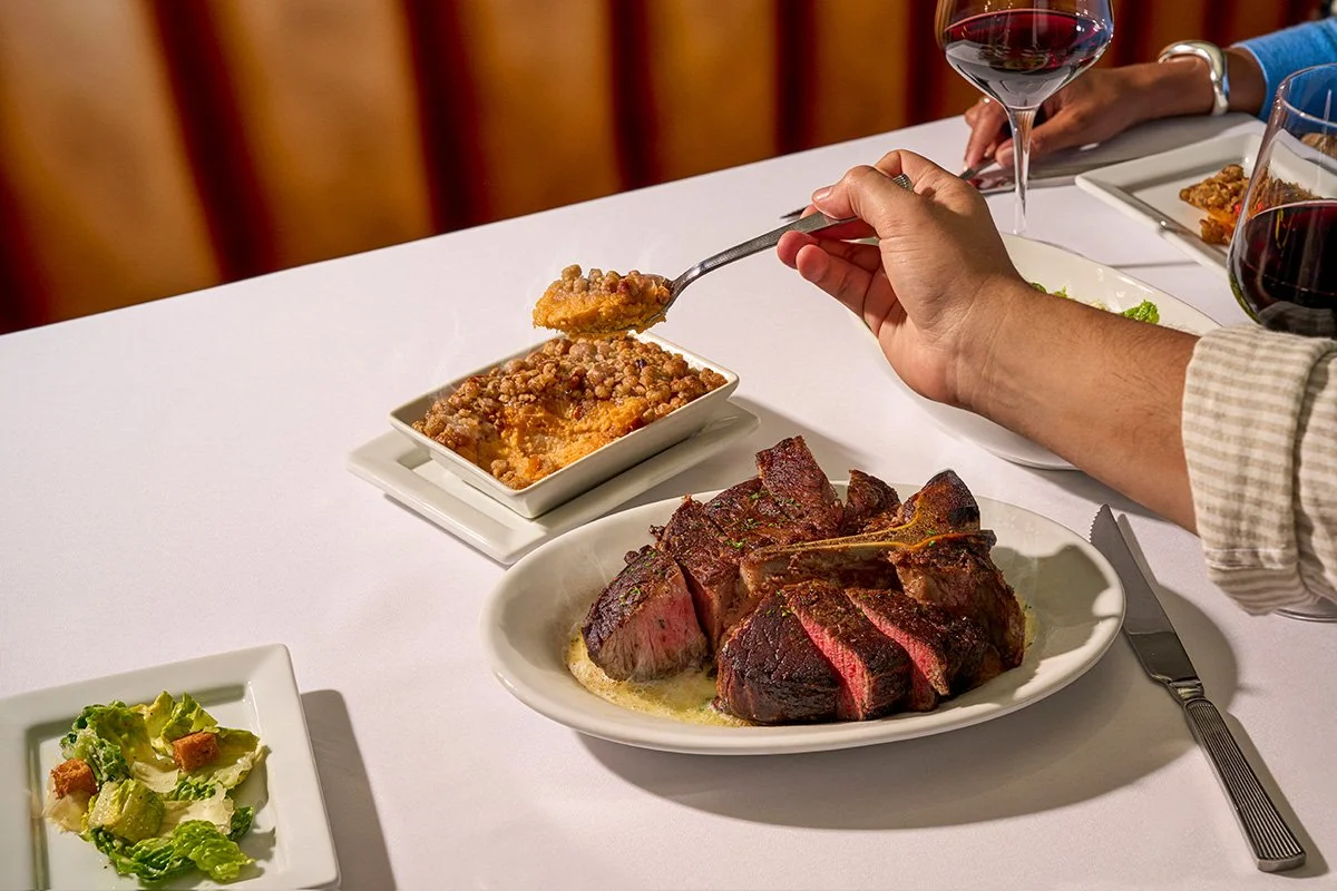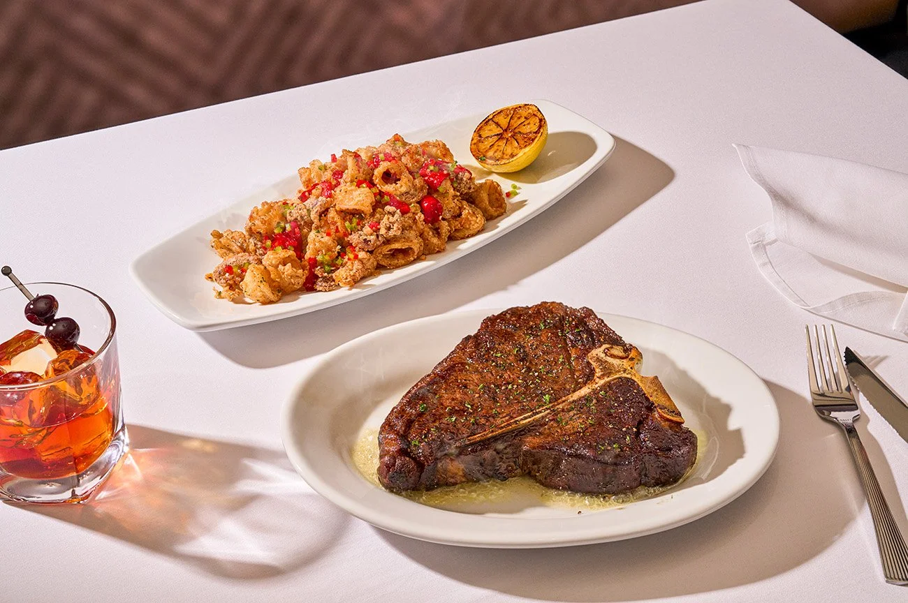
the sizzle standard
The Problem
Ruth’s Chris was known as a place for the big moments in our lives, but their identity was leaning heavy into the white-tablecloth, formal imagery style. The visuals along with the tone didn’t entirely cover Ruth' Fertel’s warmth, grit, or story. Ruth’s Chris should feel feel like the right occasion for a weekly celebration just as it does for your 10 year anniversary dinner.
The Solution
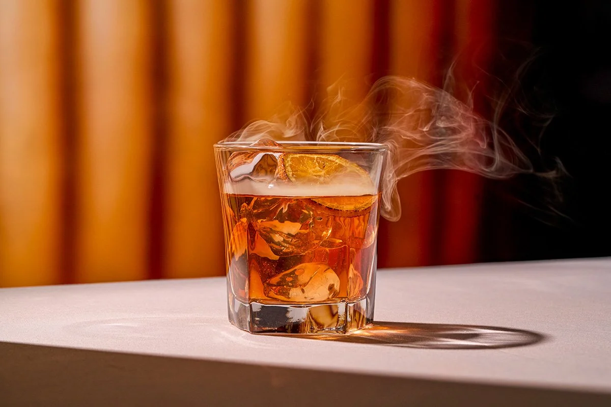
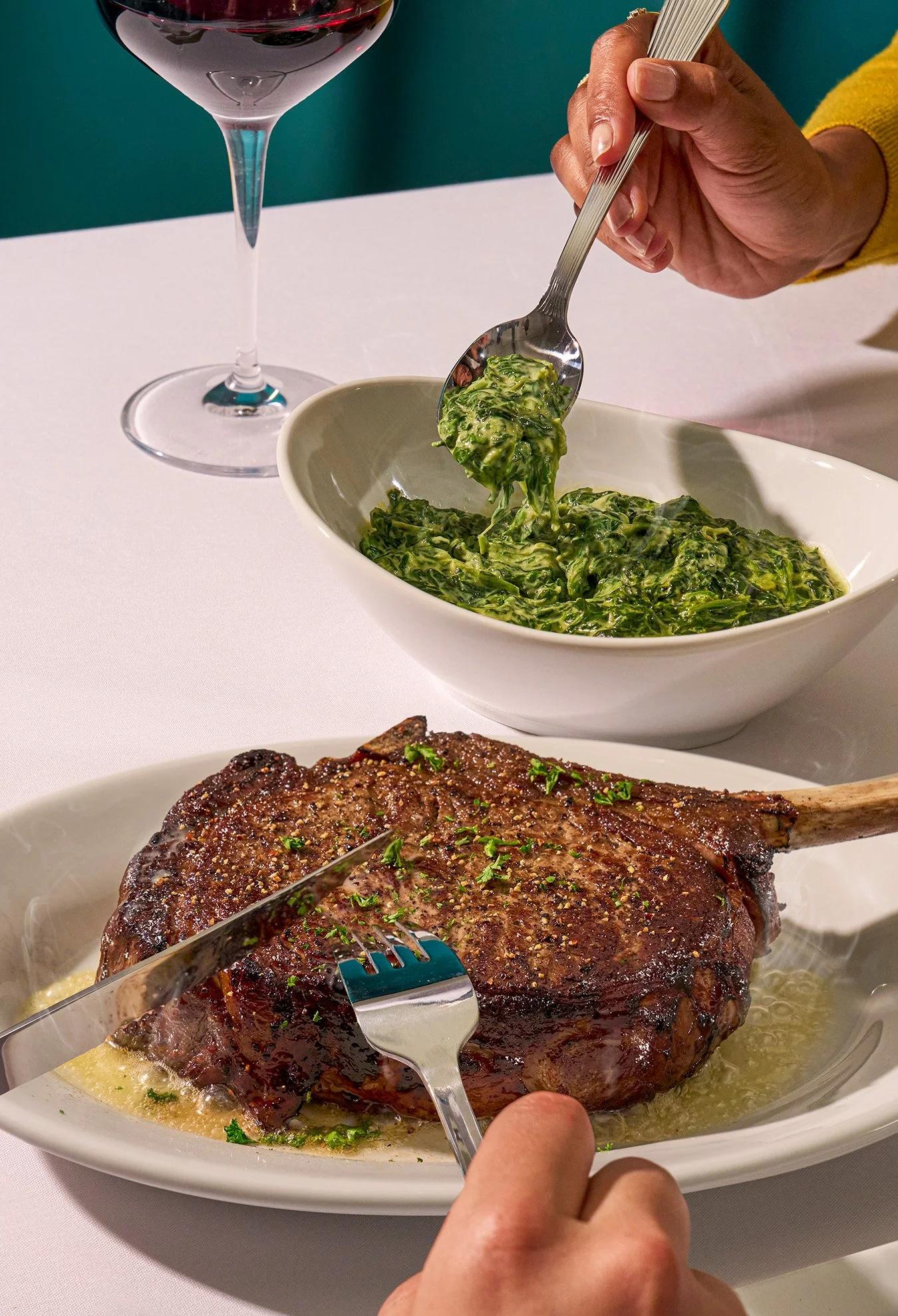
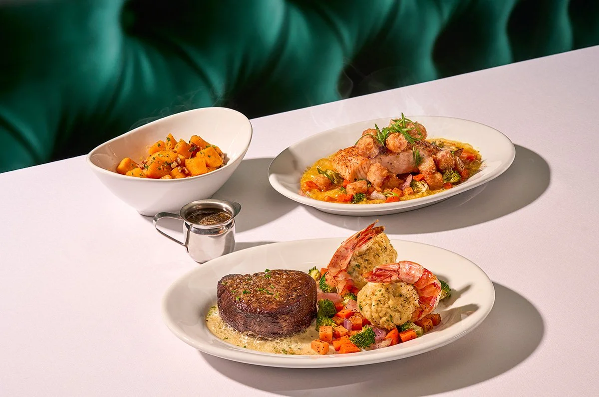
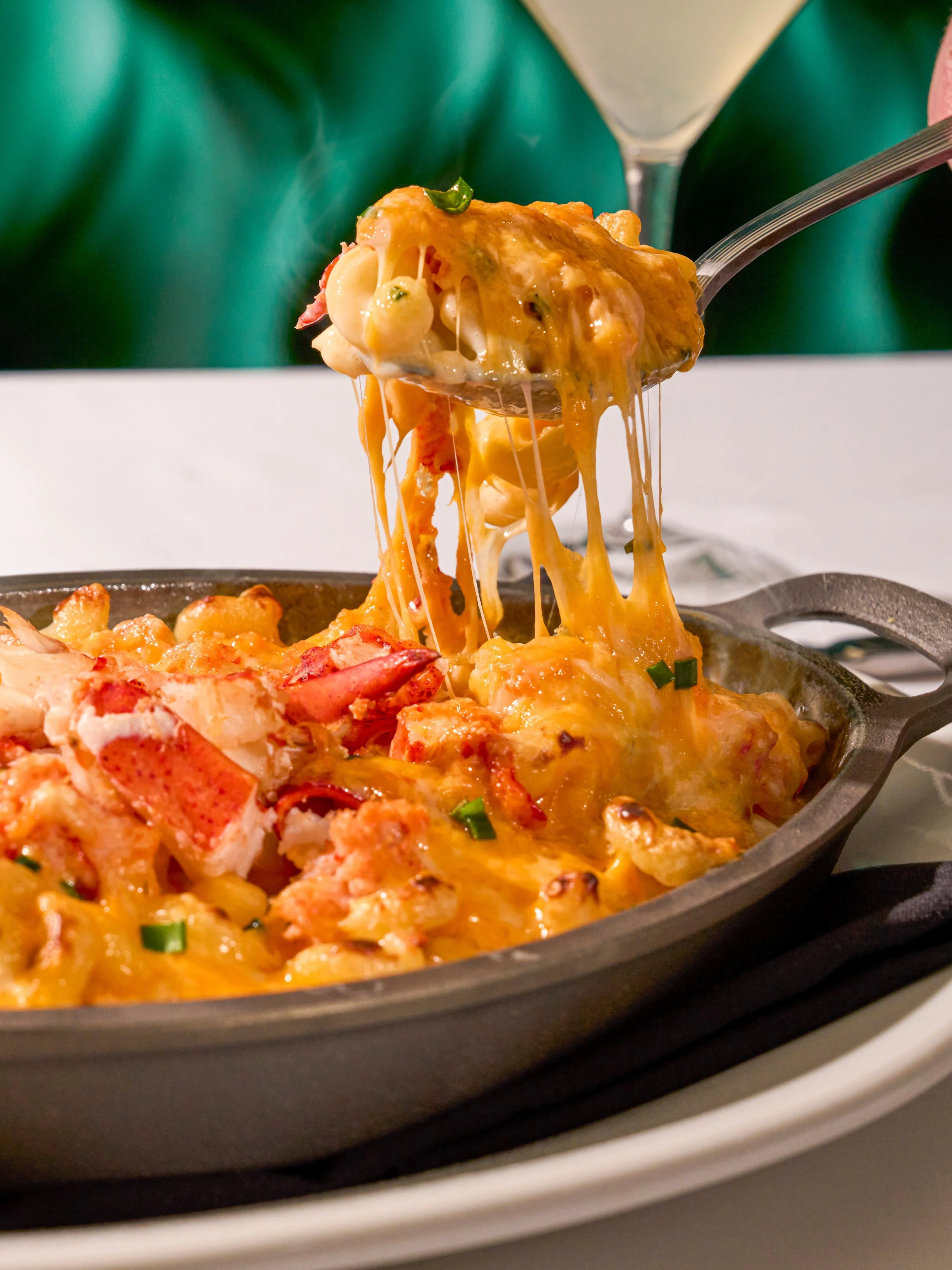
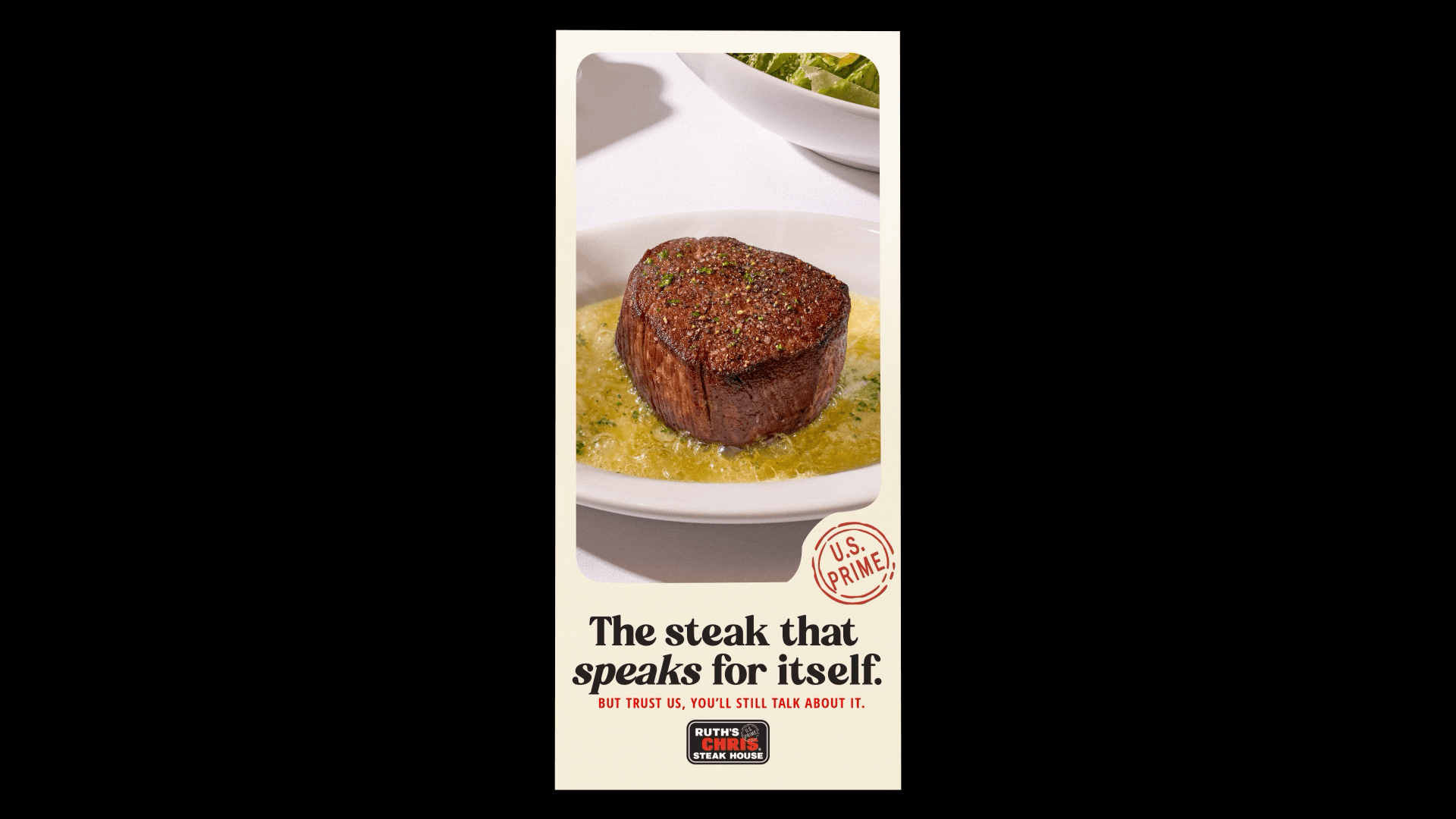
Our goal was to bring Ruth’s spirit to the surface, which meant we needed to shape a voice that was confident, yet modest. Visually we had to reimagine the imagery/visuals to feel warmer, more inviting, and more modern. Highlighting rich textures, glowing tones, and the signature sizzling butter that creates for a sensory moment that guests crave. The result of this created that feeling guests crave for a weekly celebration, or life’s biggest celebrations.