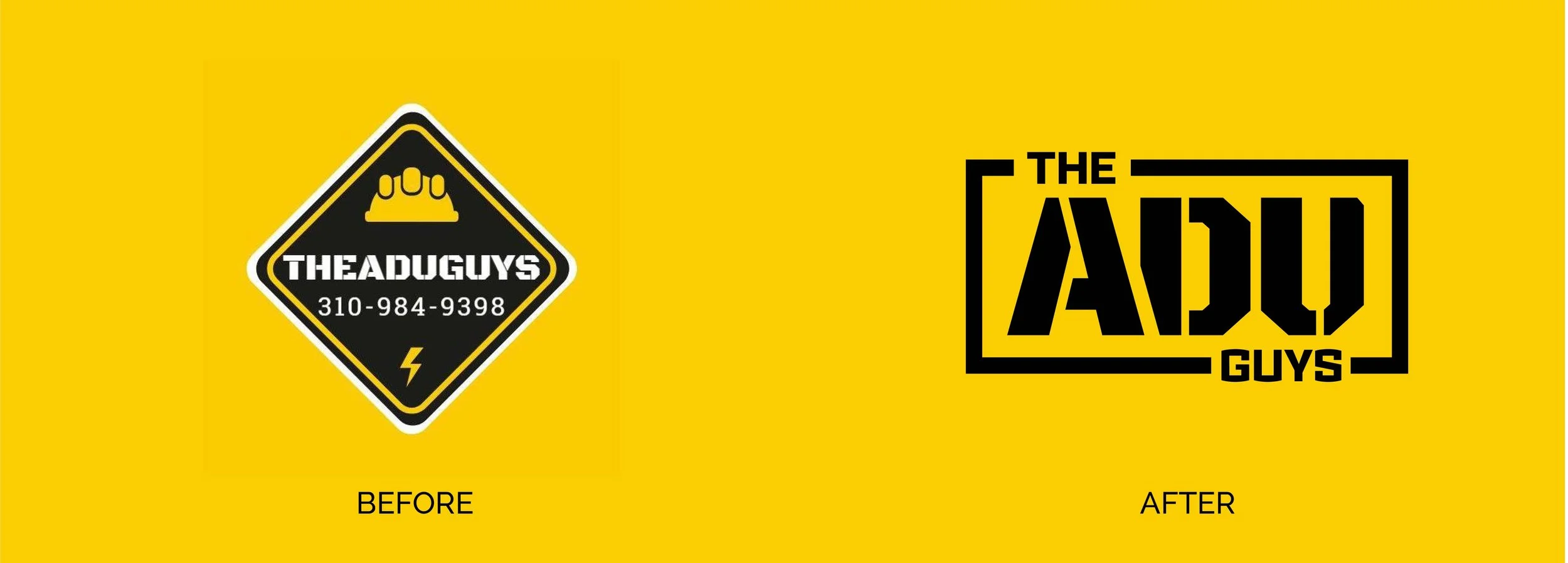
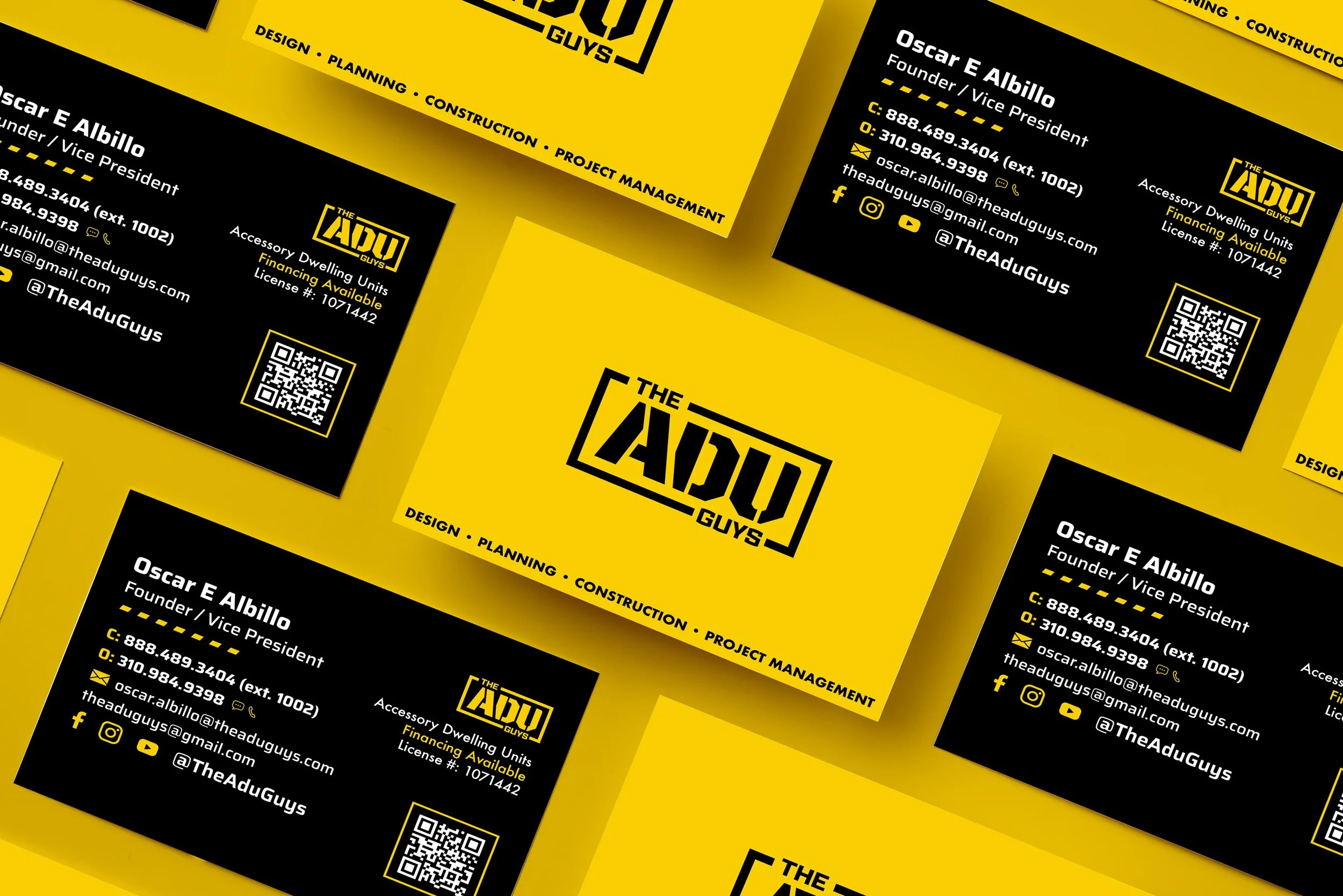
From Business Cards to Blueprint
The ADU Guys came to me for a quick business card refresh, but it was clear right away the real problem was their brand. It didn’t reflect the quality, versatility, or professionalism of their work. These guys build Accessory Dwelling Units from the ground up. Handling construction, consulting, and project management. They bring creative solutions to life, but their branding just wasn’t doing that story justice.
So I gave them a full brand revamp. I designed a logo that reflects how they actually build, sharp lines, smart structure, and a clean layout that mirrors the planning behind each project. I kept things modern and simple, and used yellow to bring some energy and optimism into the system. Paired with black and white, it gives the brand a bold contrast that stands out.
Now their identity feels like their work: clear, professional, and built with purpose.