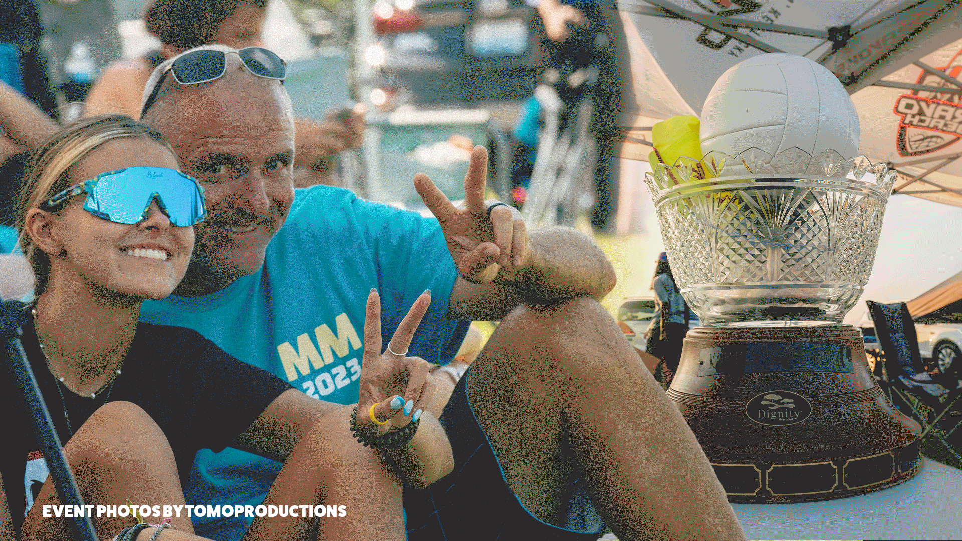
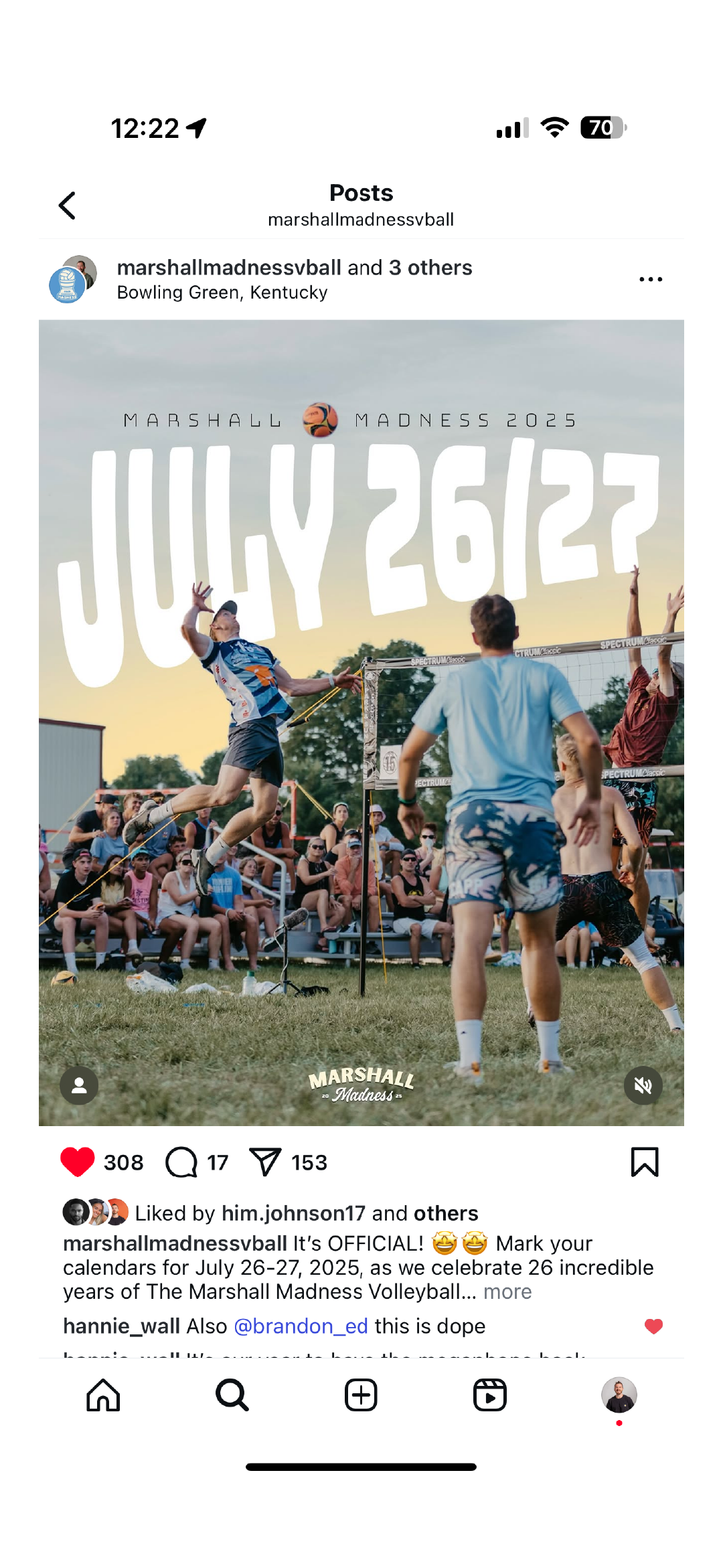
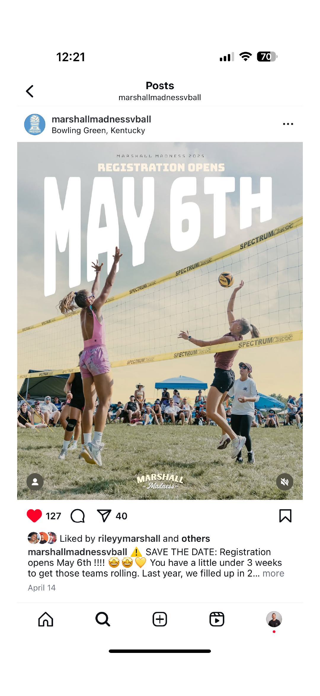
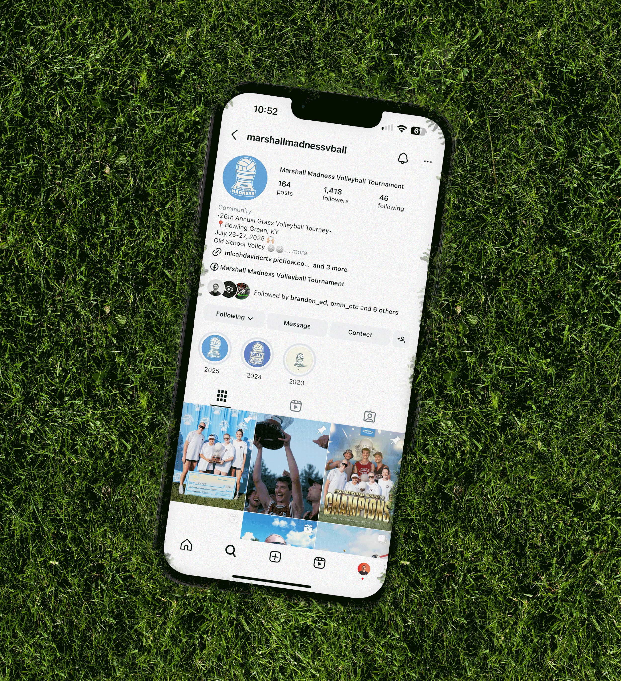
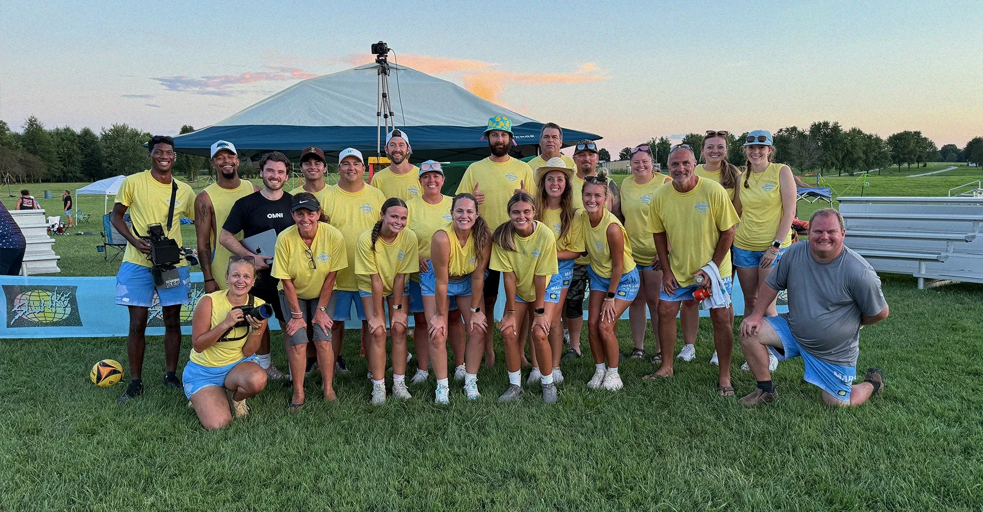
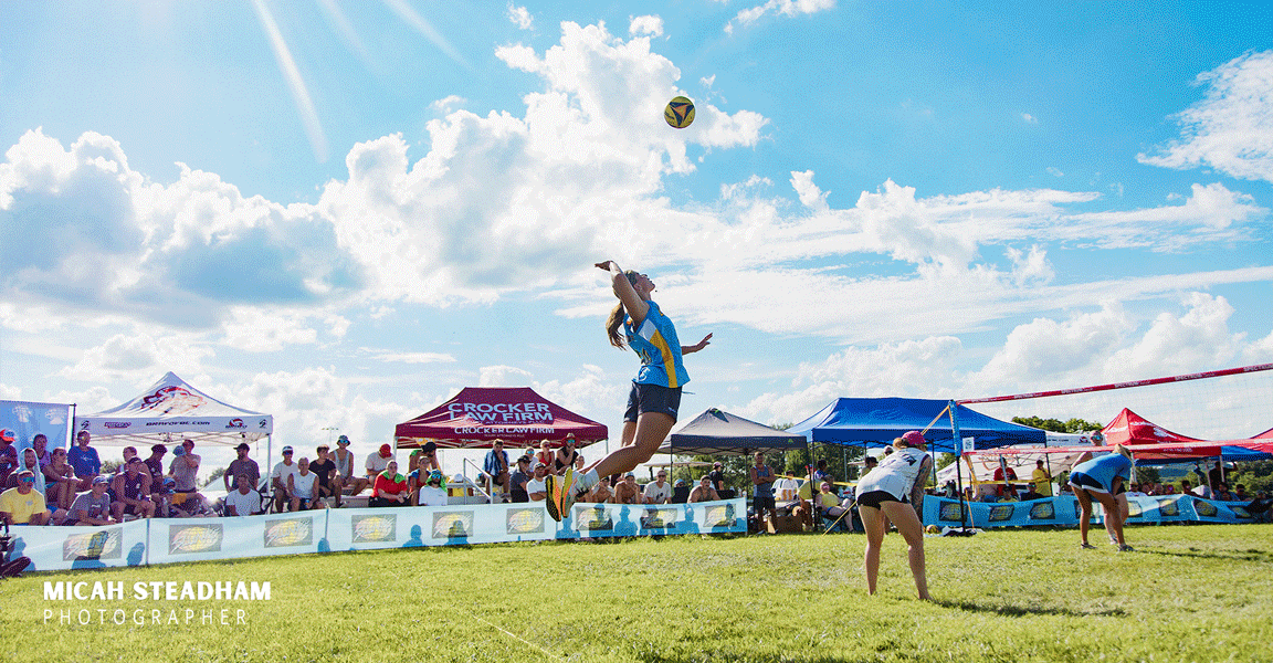
A Grassroots Legacy
Marshall Madness started in a backyard and grew into one of the most iconic small-town volleyball tournaments in the country. I’ve been close to this family for years and the founder was like a second dad to me during college and taught me how to play grass volleyball at a high level. That personal connection made this project more than just branding, it was about honoring a legacy.
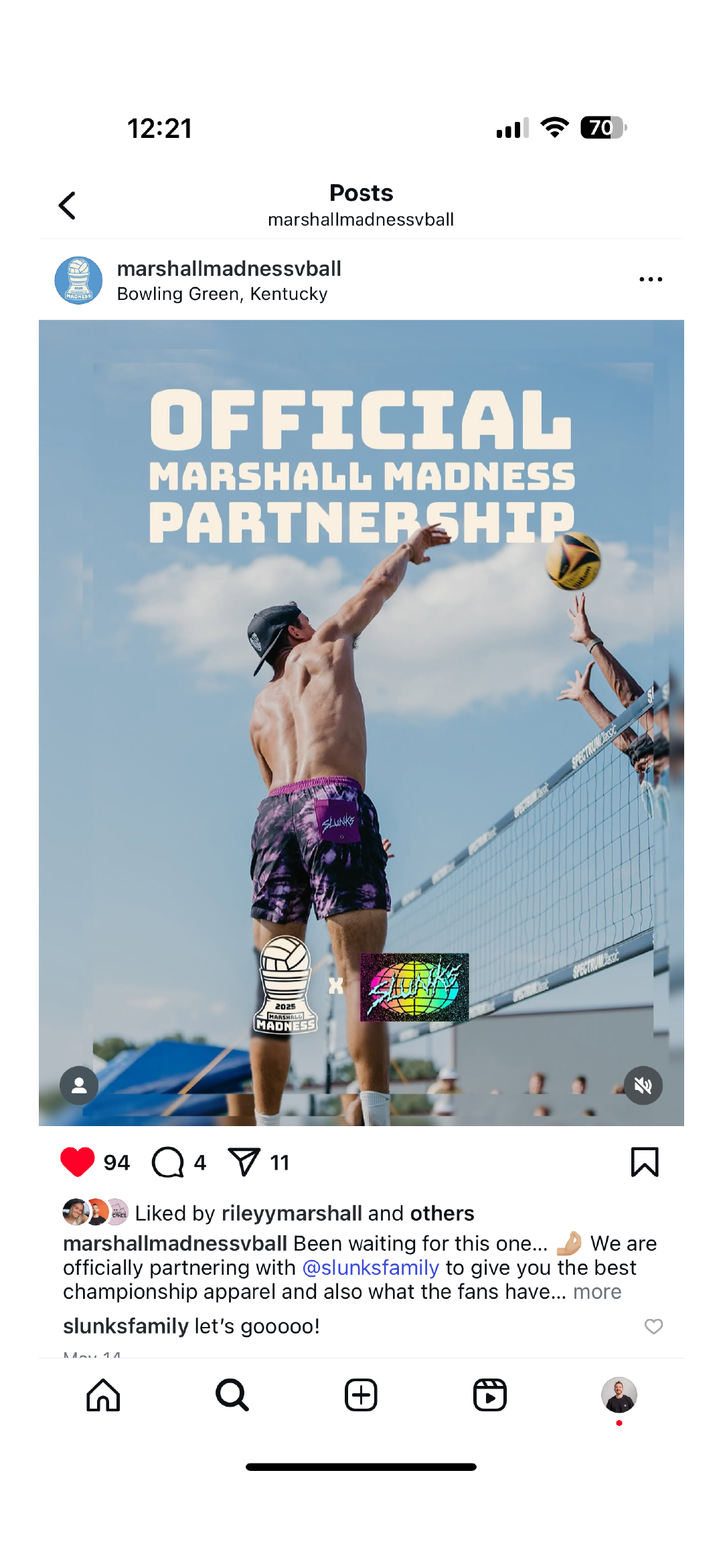
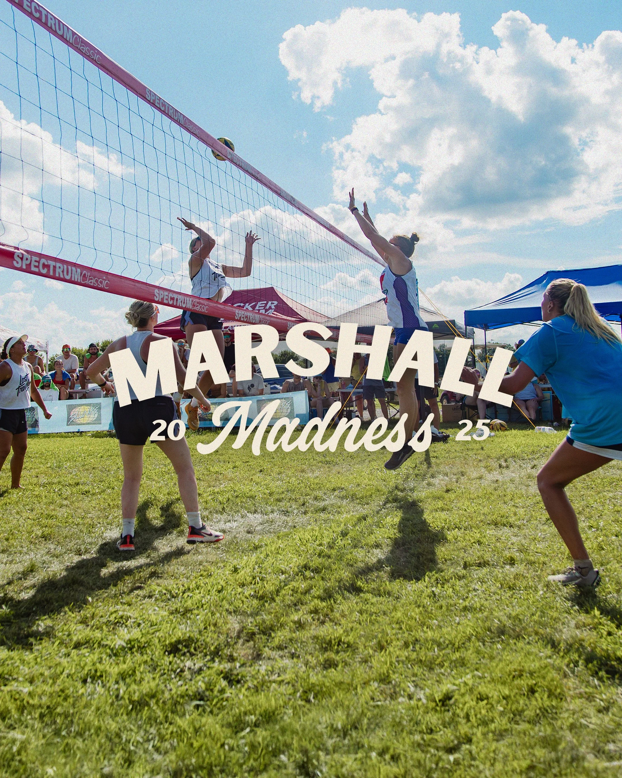
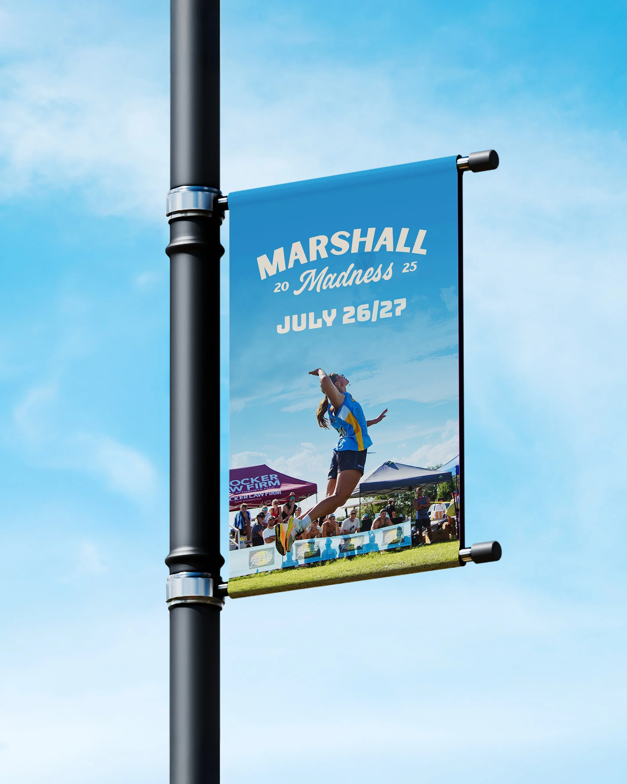
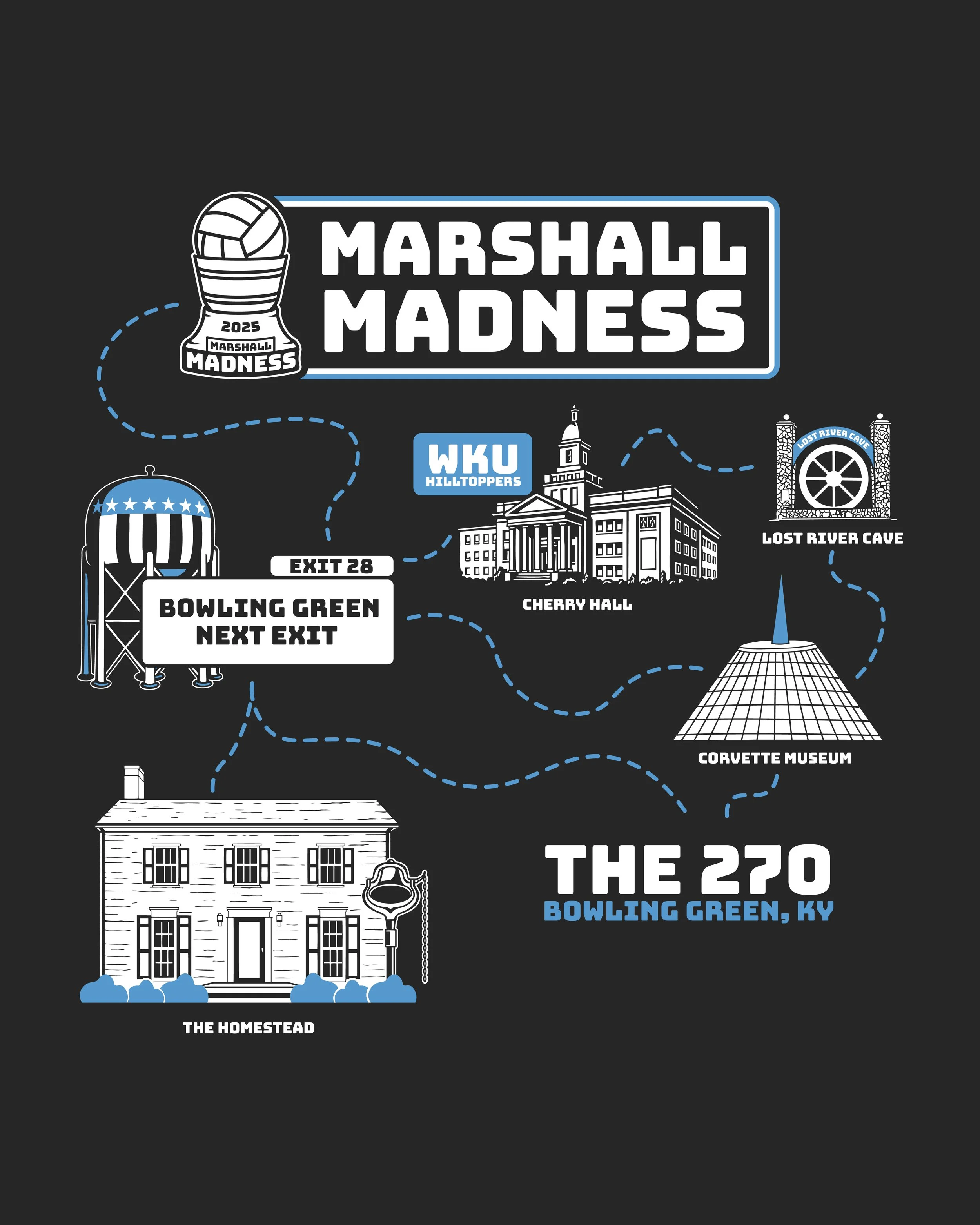
The goal was to design logos and badges that felt uniquely Marshall: rooted in hometown pride, history, and good vibes. I pulled inspiration from meaningful elements like the original trophy, net, and volleyball. All symbols of the tournament’s story. The typeface strikes a balance: not too serious, not too playful, very welcoming. Since the colors change each year, I built a flexible system that adapts annually while maintaining a strong, consistent identity.
This brand isn’t just built to last. It’s built to evolve.


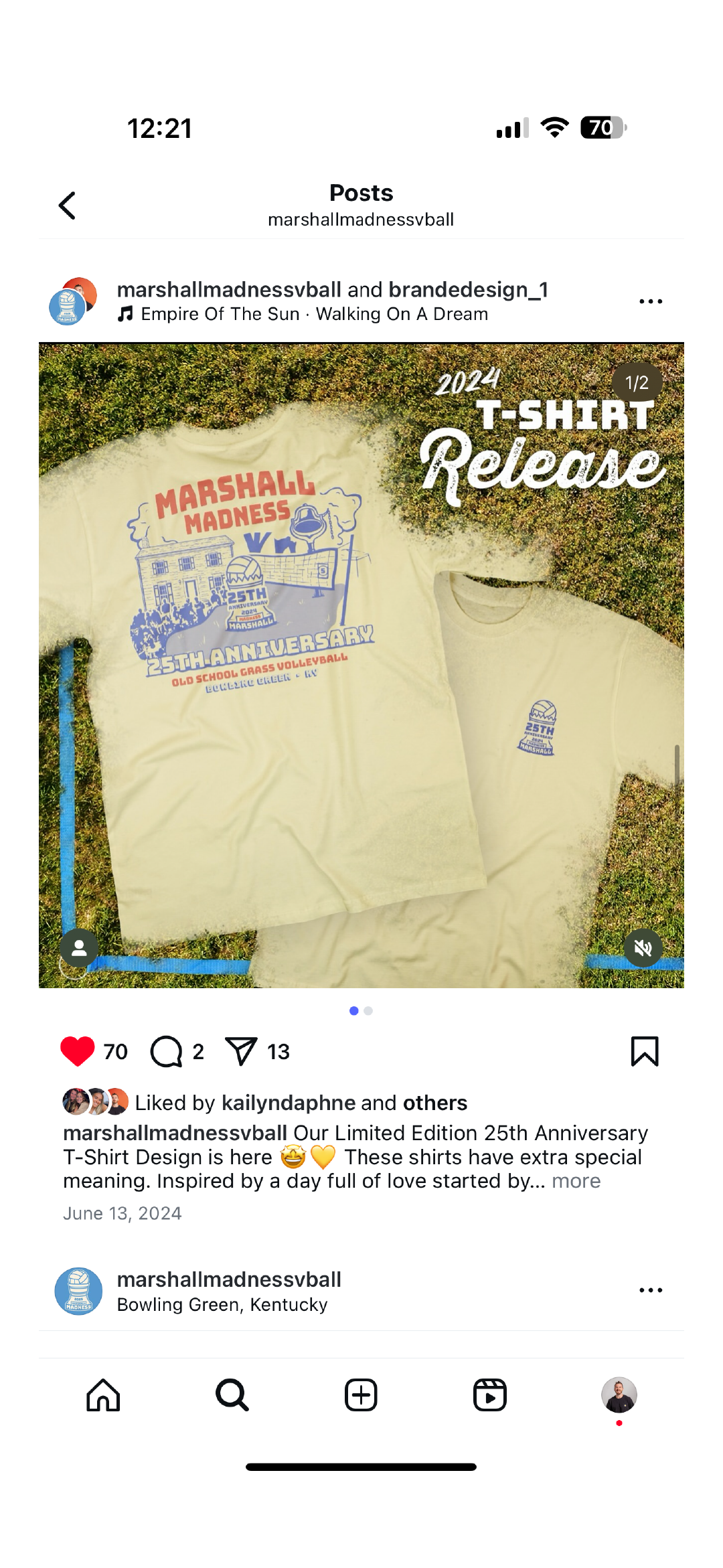
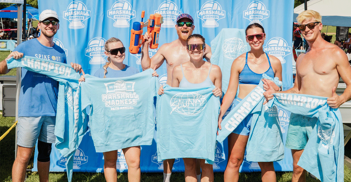
merch design


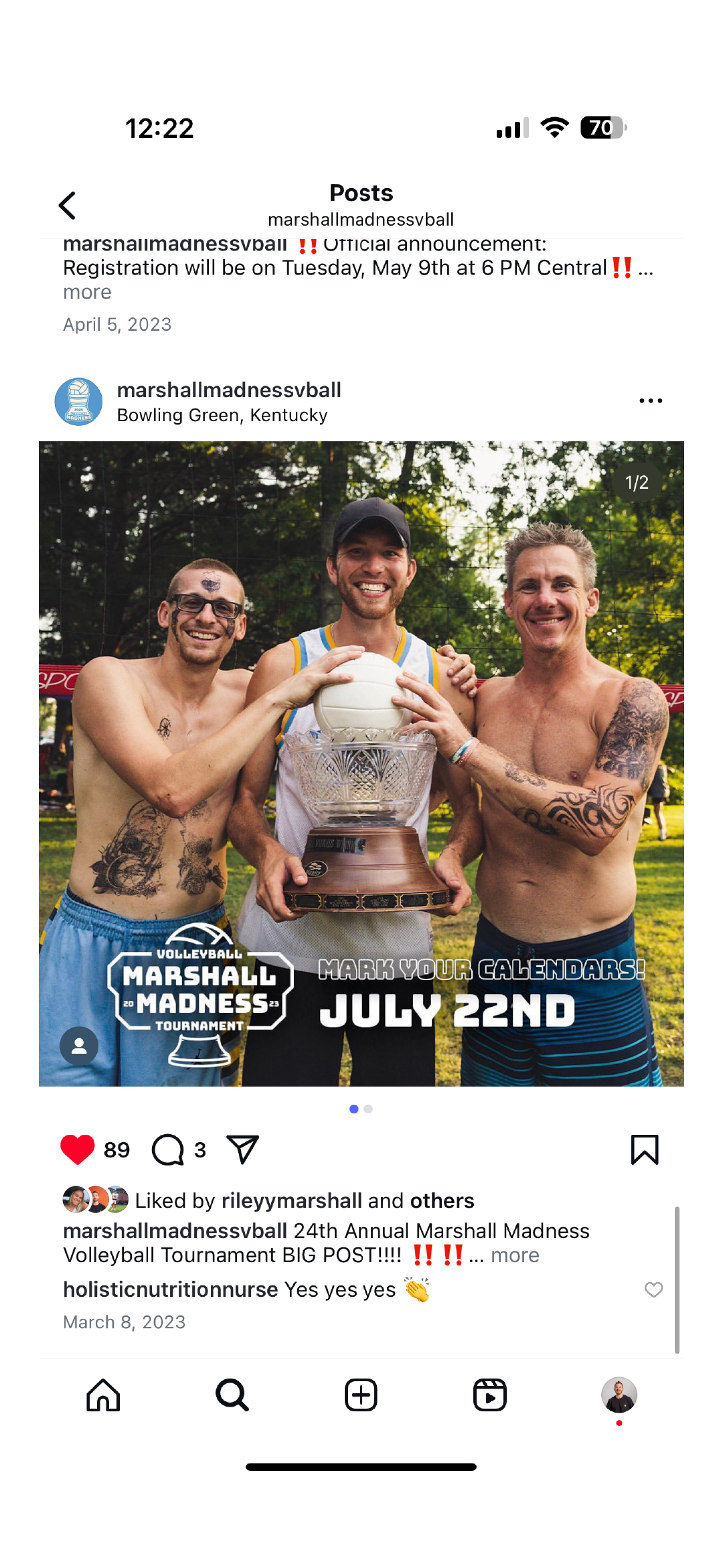
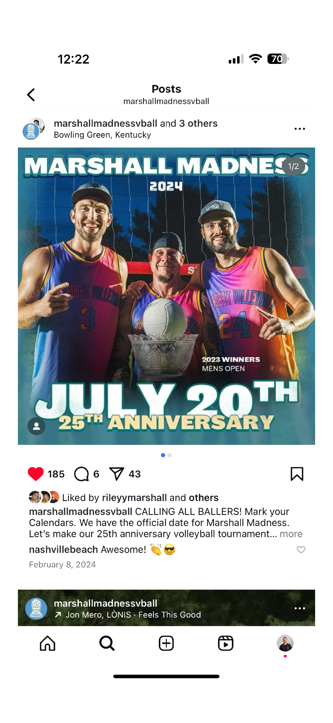
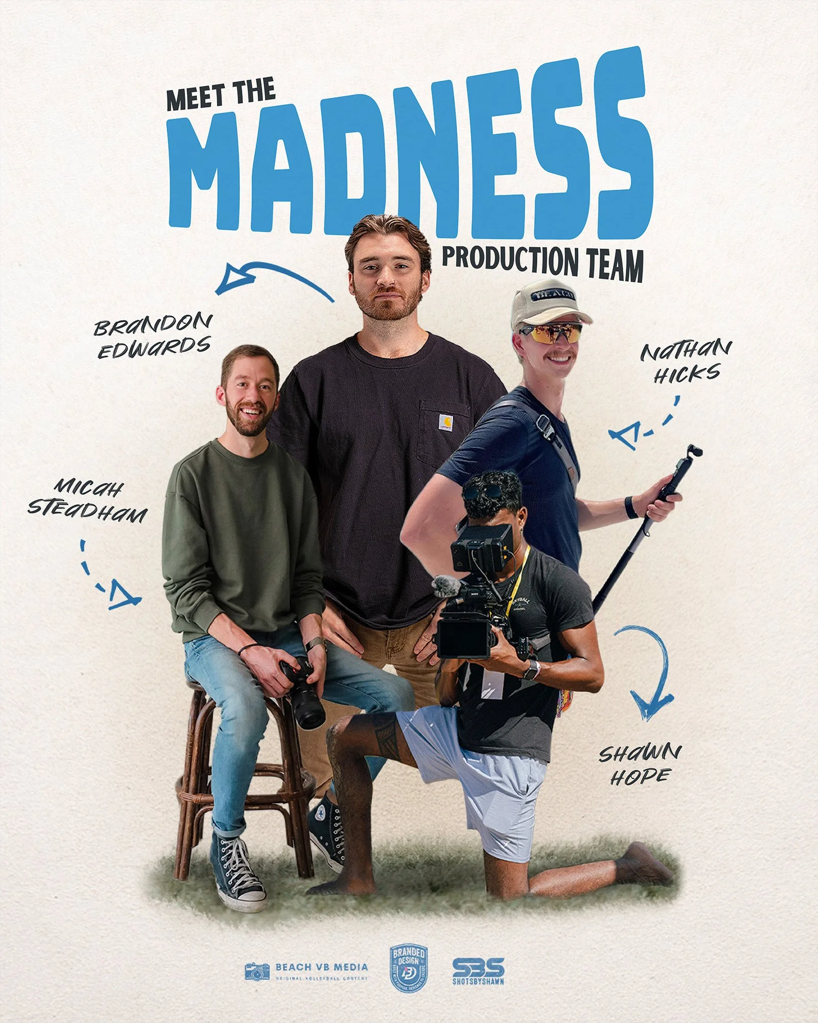
Past Years Creative