Boots Contracting was already over a year into business, producing solid work and earning trust the right way.
But visually, the brand hadn’t caught up to the standard that was being set on the job site.
Like many business owners/Entrepreneur’s in that phase, Richard leaned on AI tools to move quickly and fill the gap. What he ended up with wasn’t wrong, it just wasn’t his.
The identity lacked ownership, depth, and permanence.
It didn’t reflect the discipline, integrity, or craftsmanship that defined the company day in and day out.
Without a true identity in place, there was nothing anchoring where the brand was headed. No clear mark that carried the weight of the work, or the longevity of what was being built.
The goal was never to simply design a logo.
It was to replace something temporary with something intentional, built on a solid foundation.
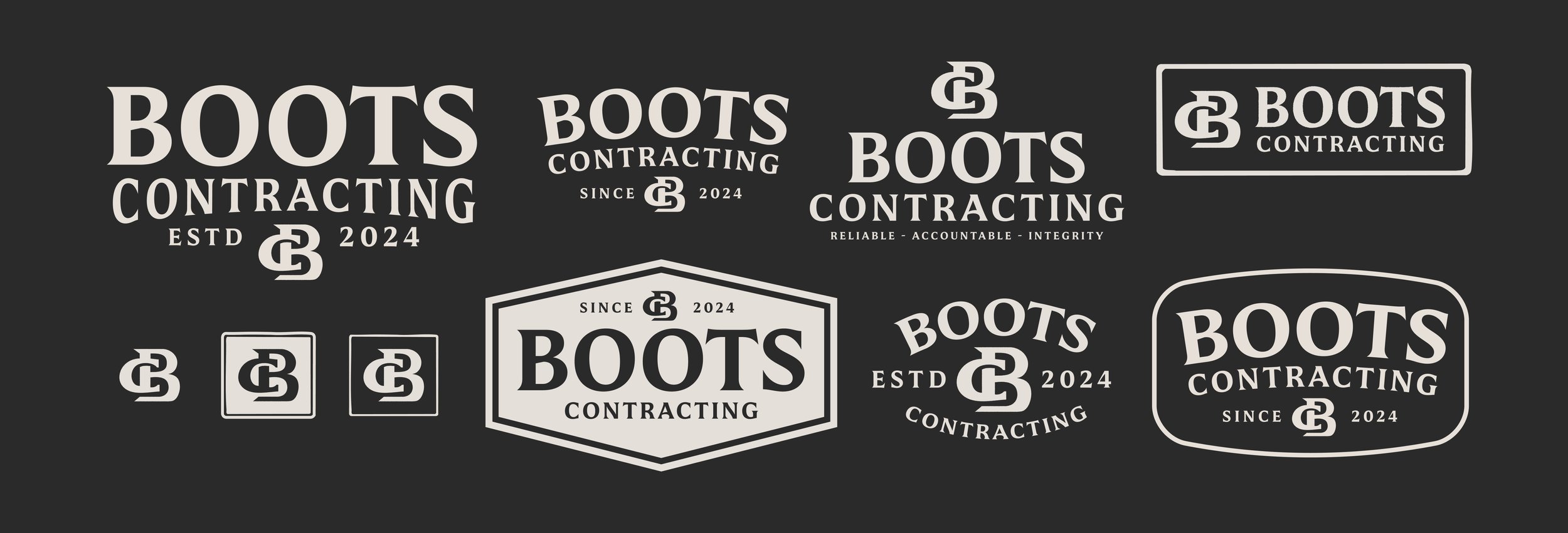
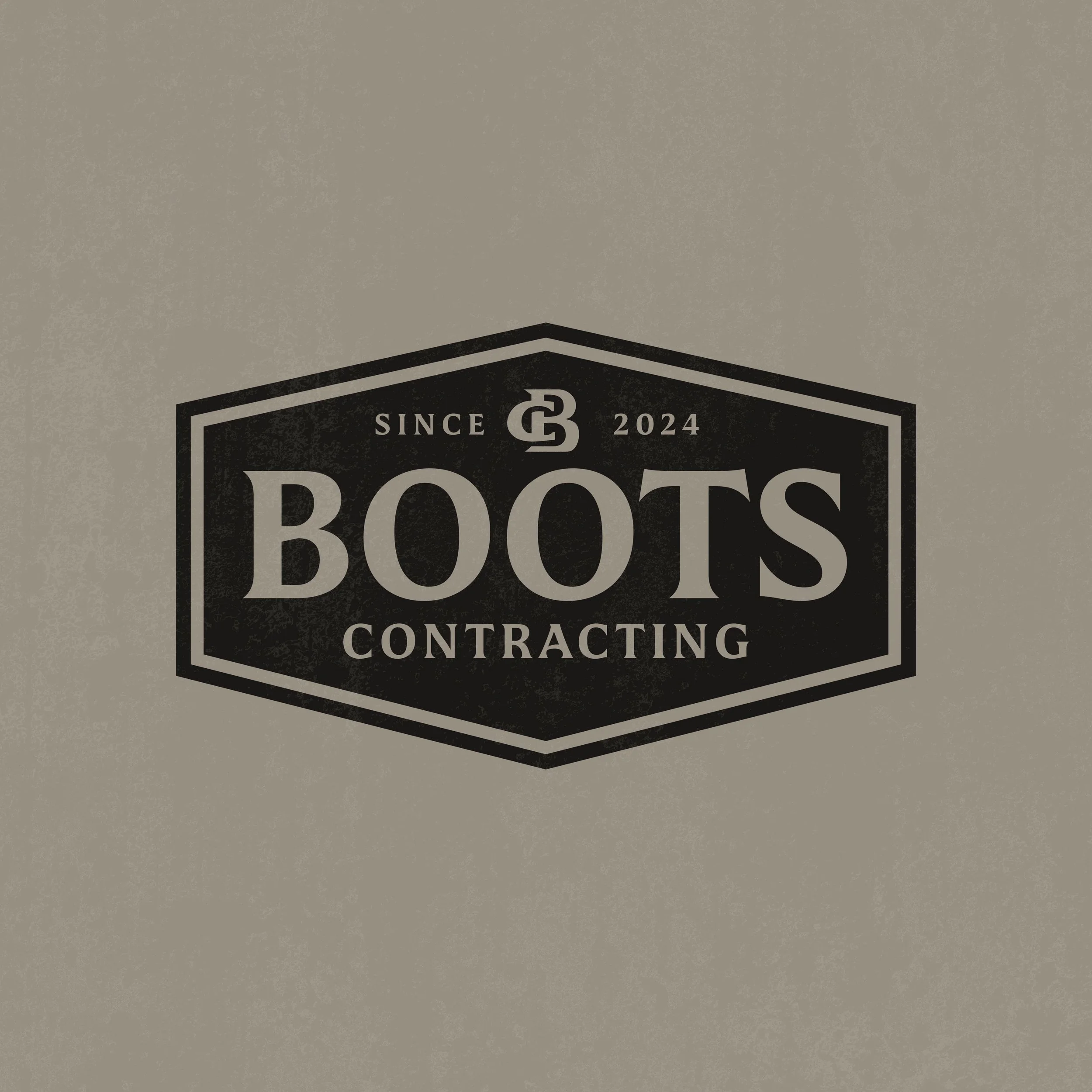
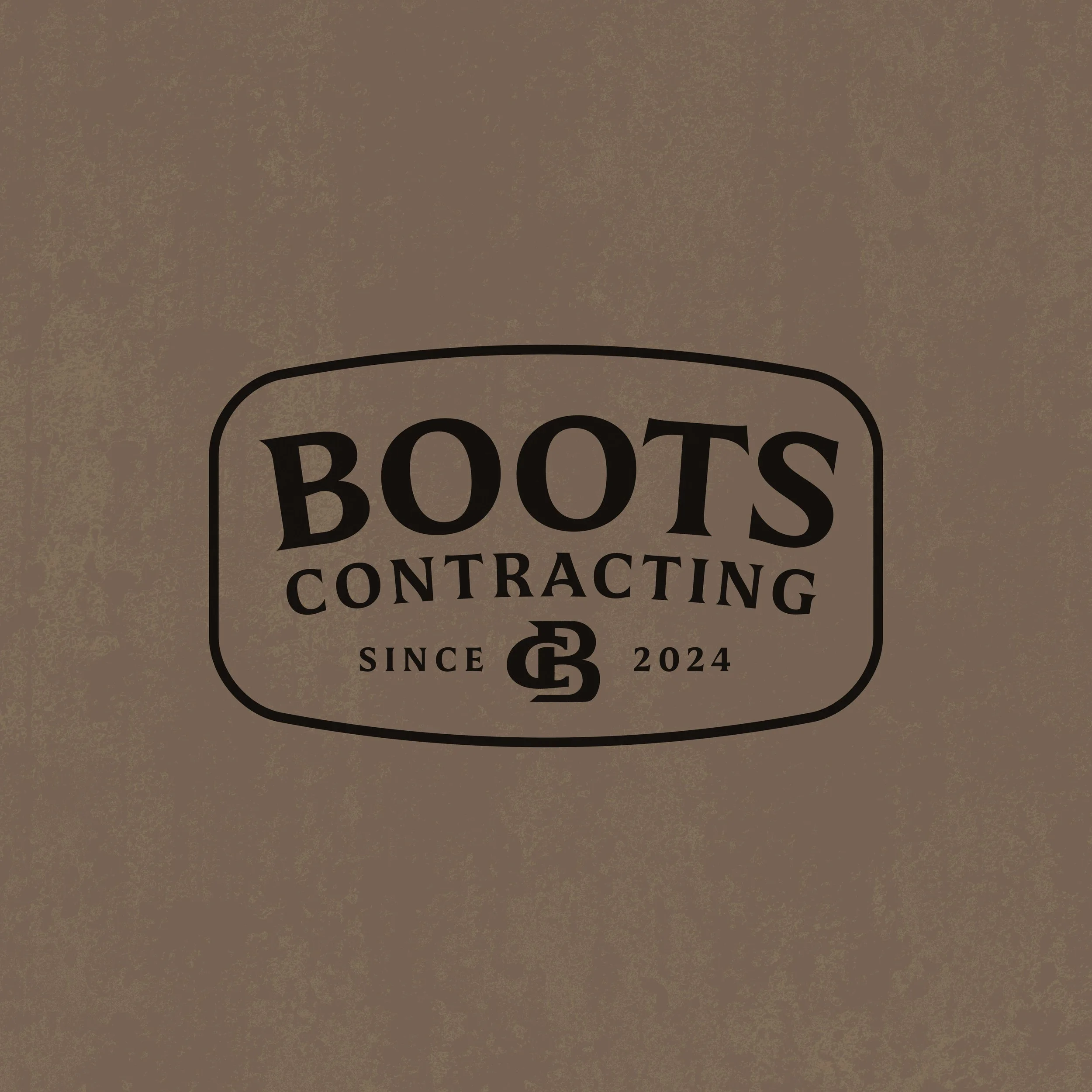
We stripped the brand back and rebuilt it with restraint and clarity.
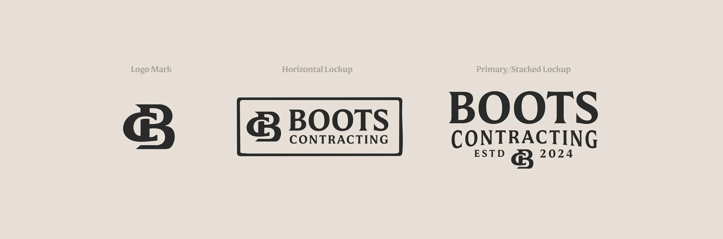
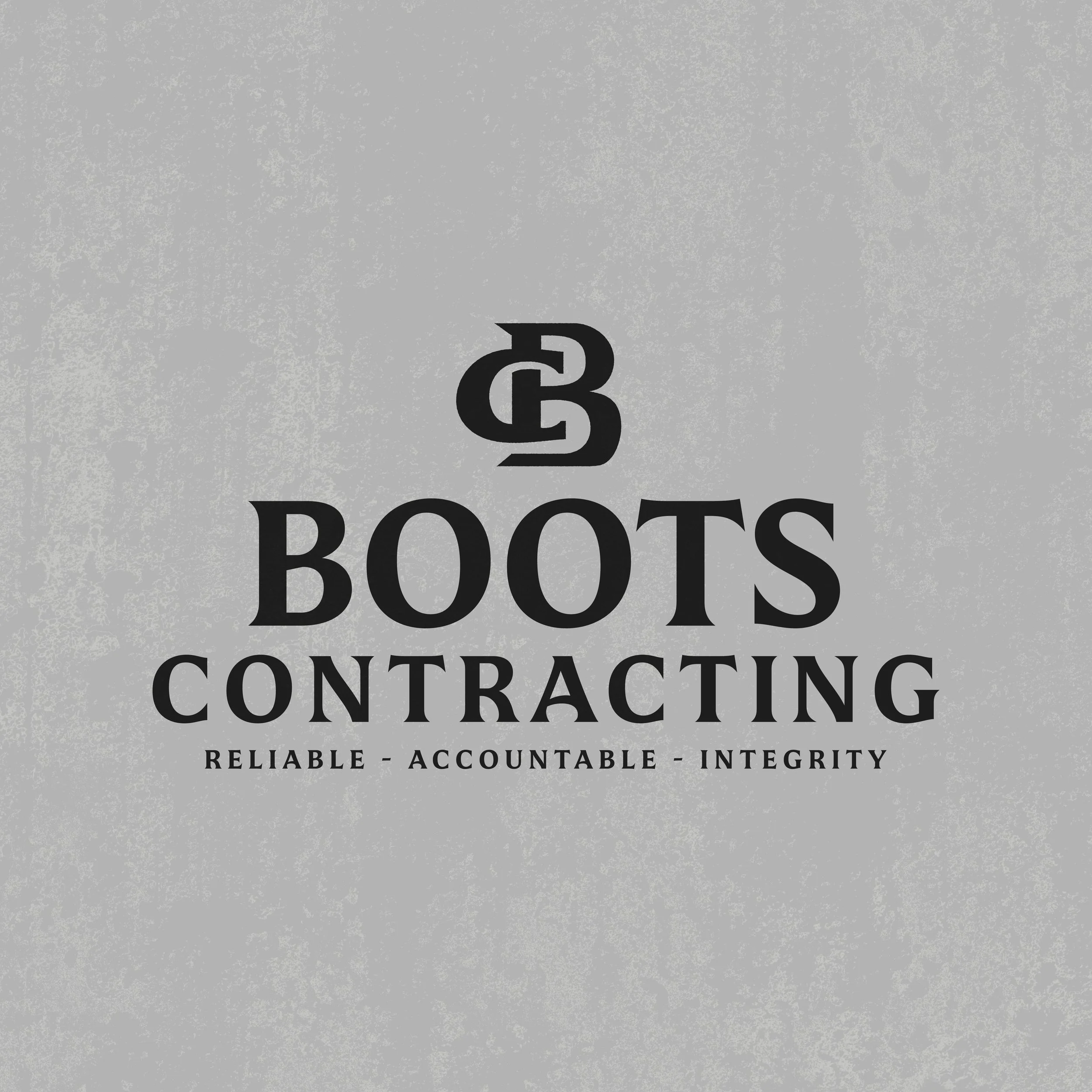
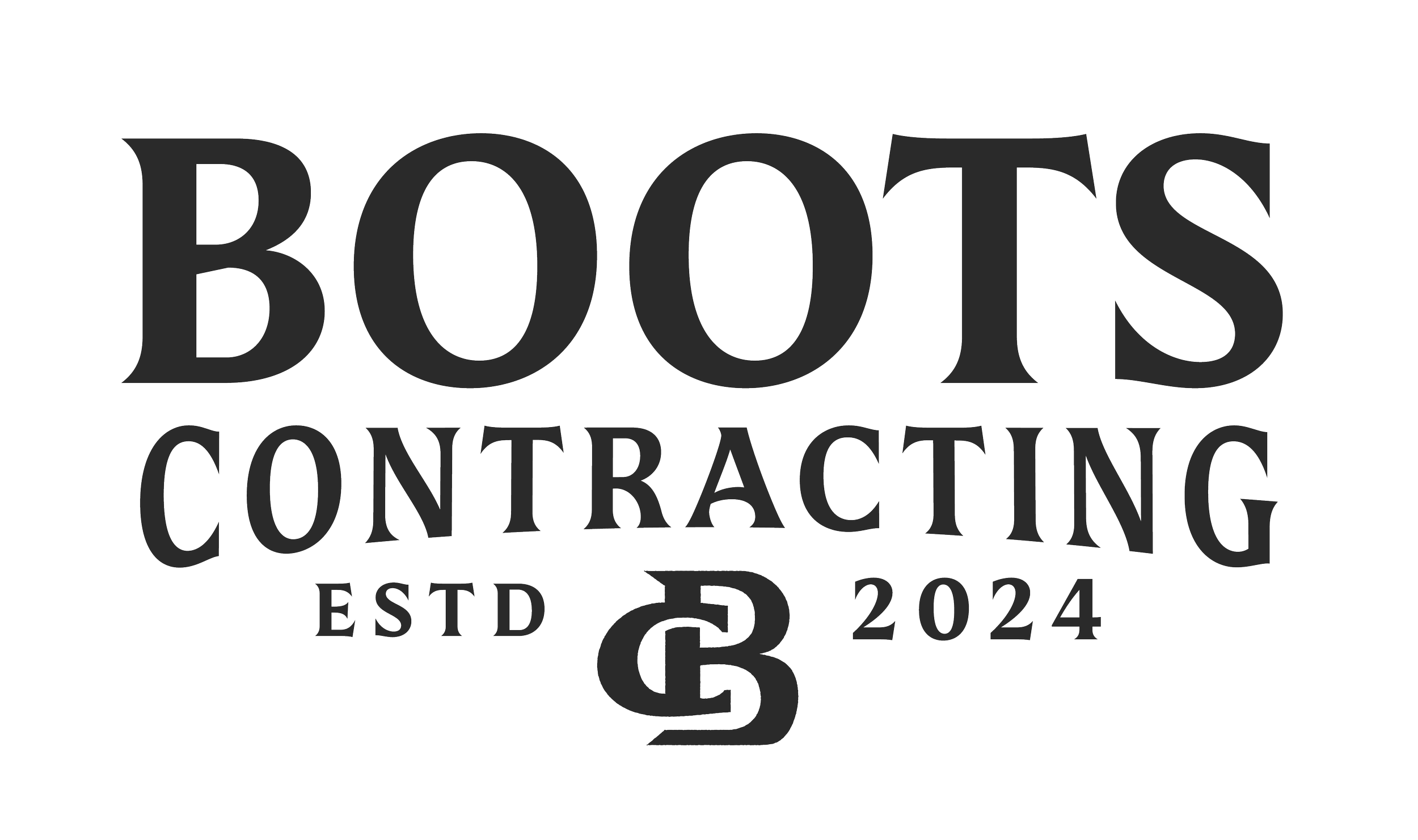
A timeless serif to ground the identity in longevity.
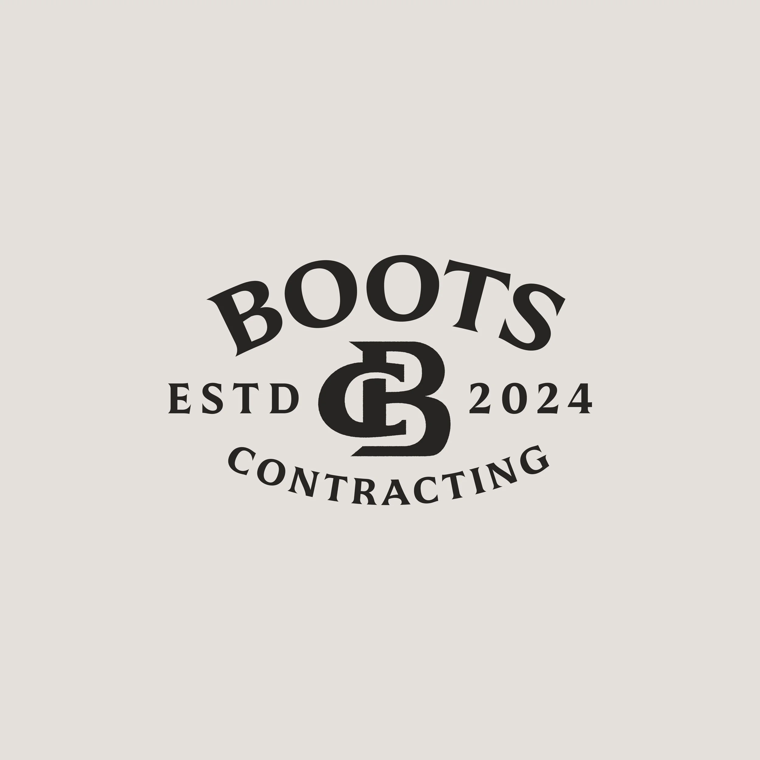
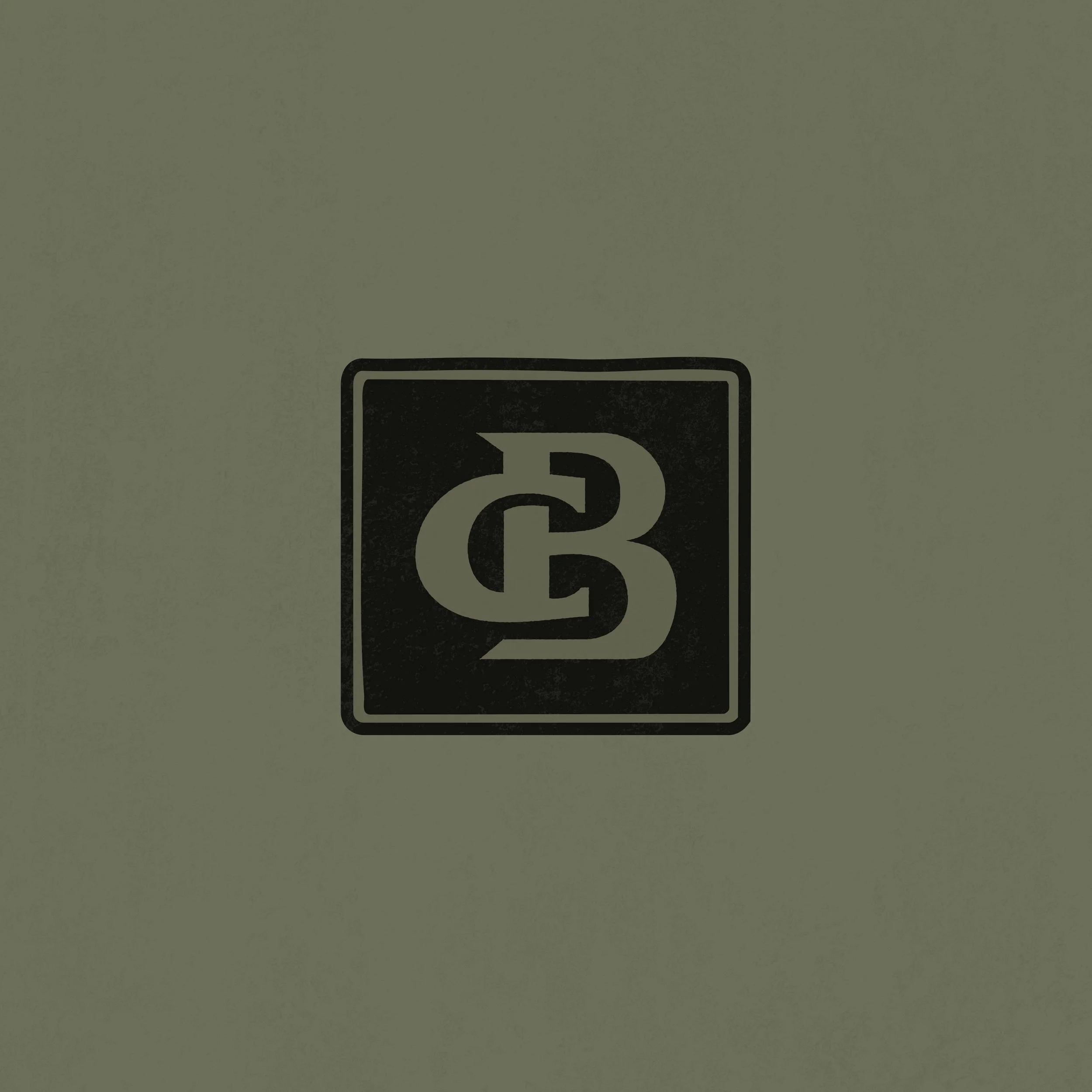
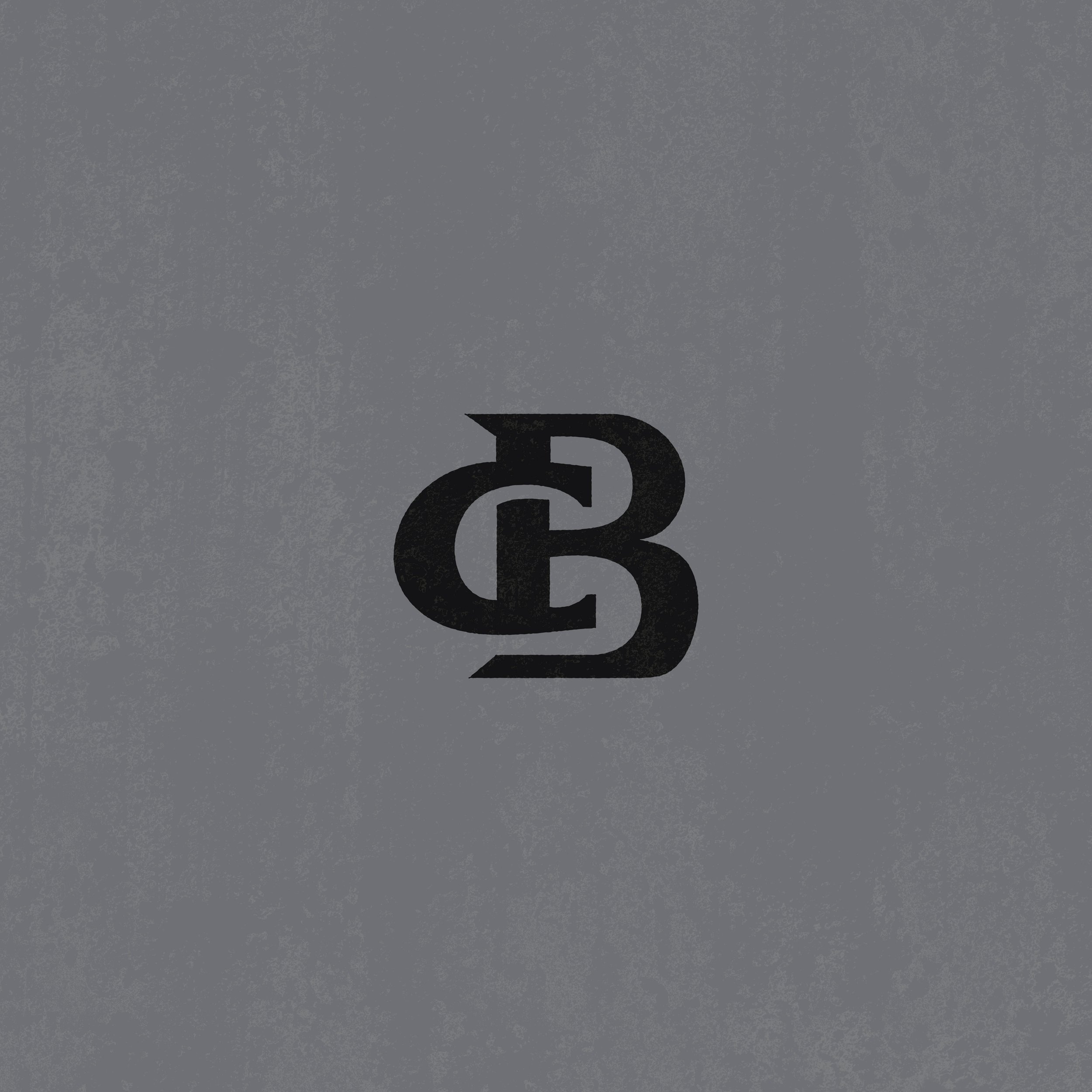
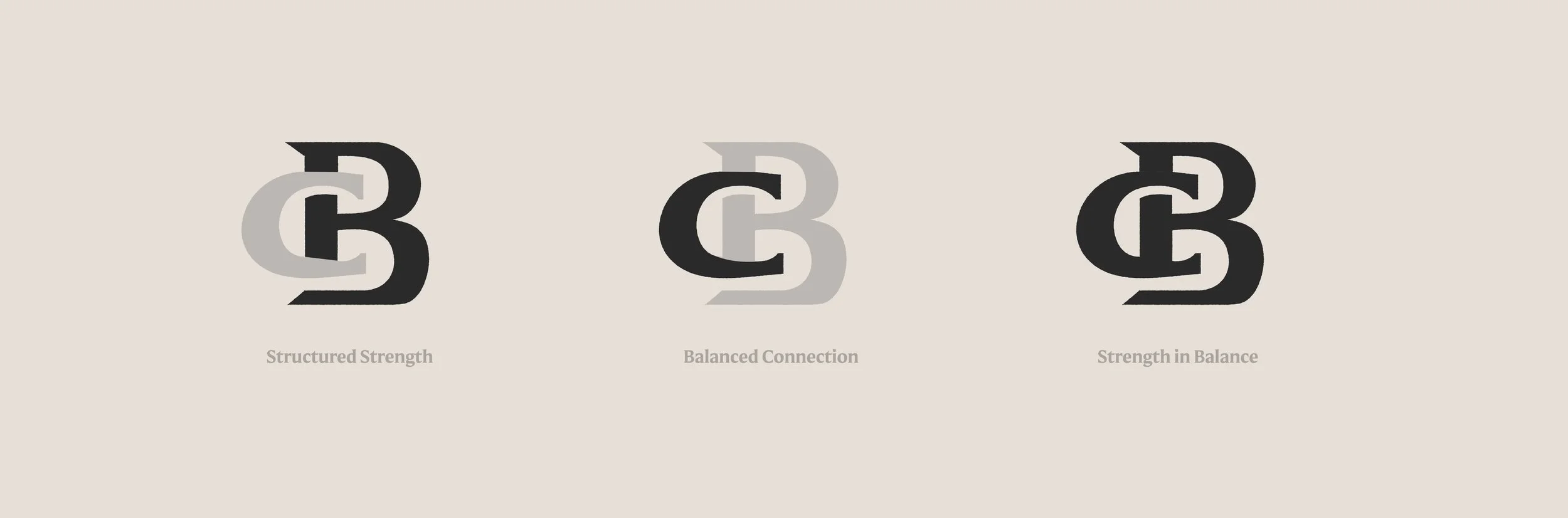
A custom hand-drawn mark built on balance and structure.
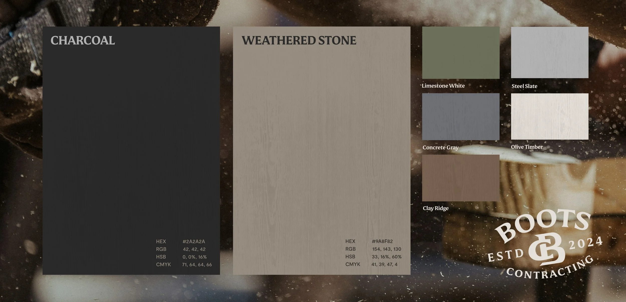
A neutral palette that feels dependable, confident, and earned, without trying to stand out for the sake of it.
Every decision was made with the long haul in mind.
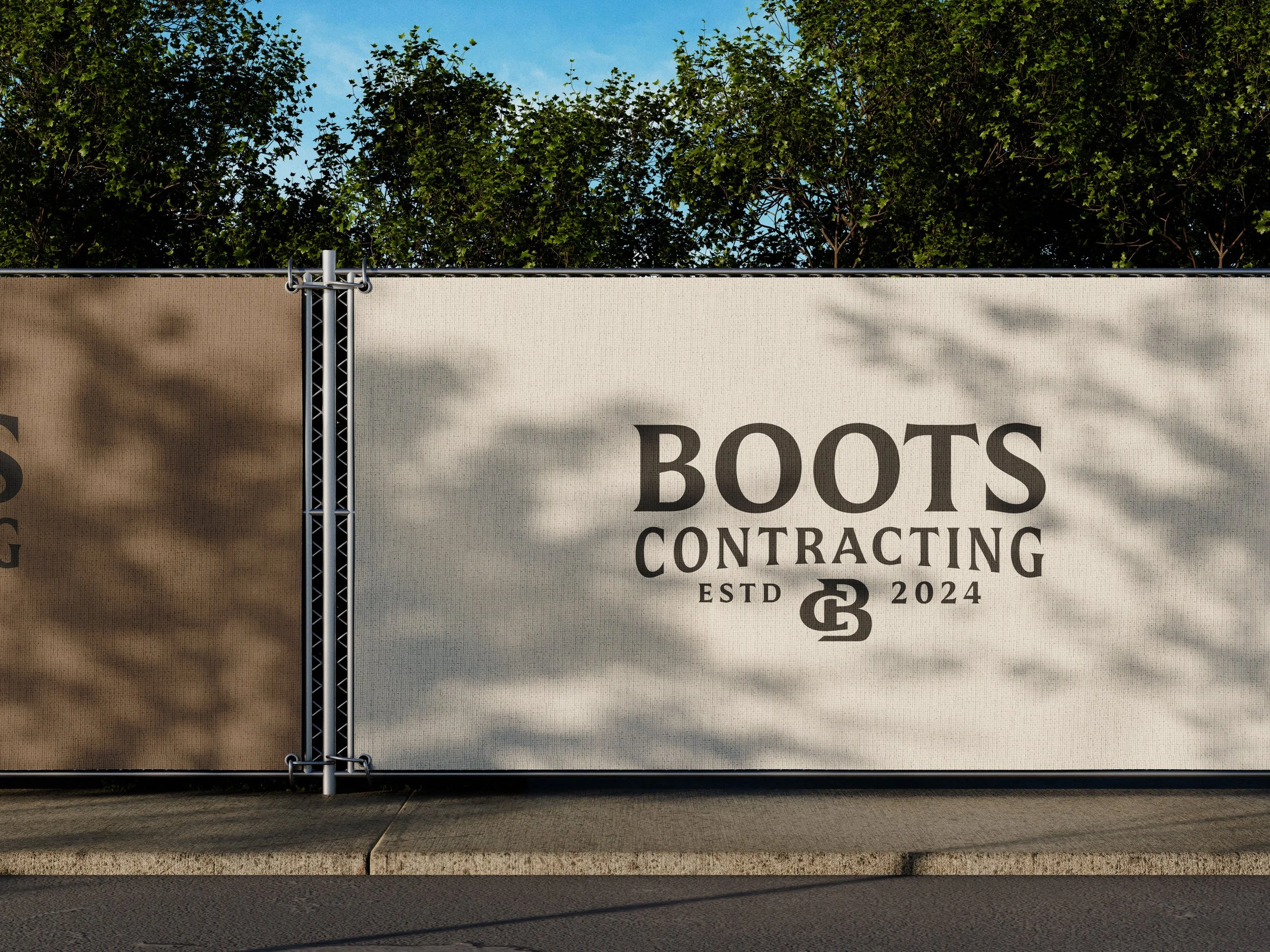
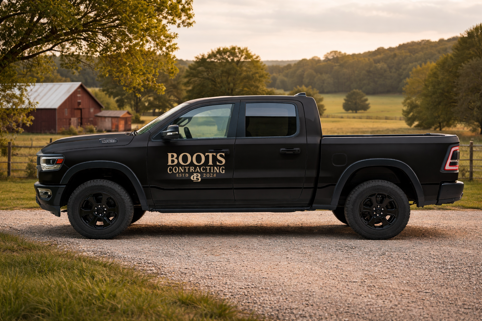
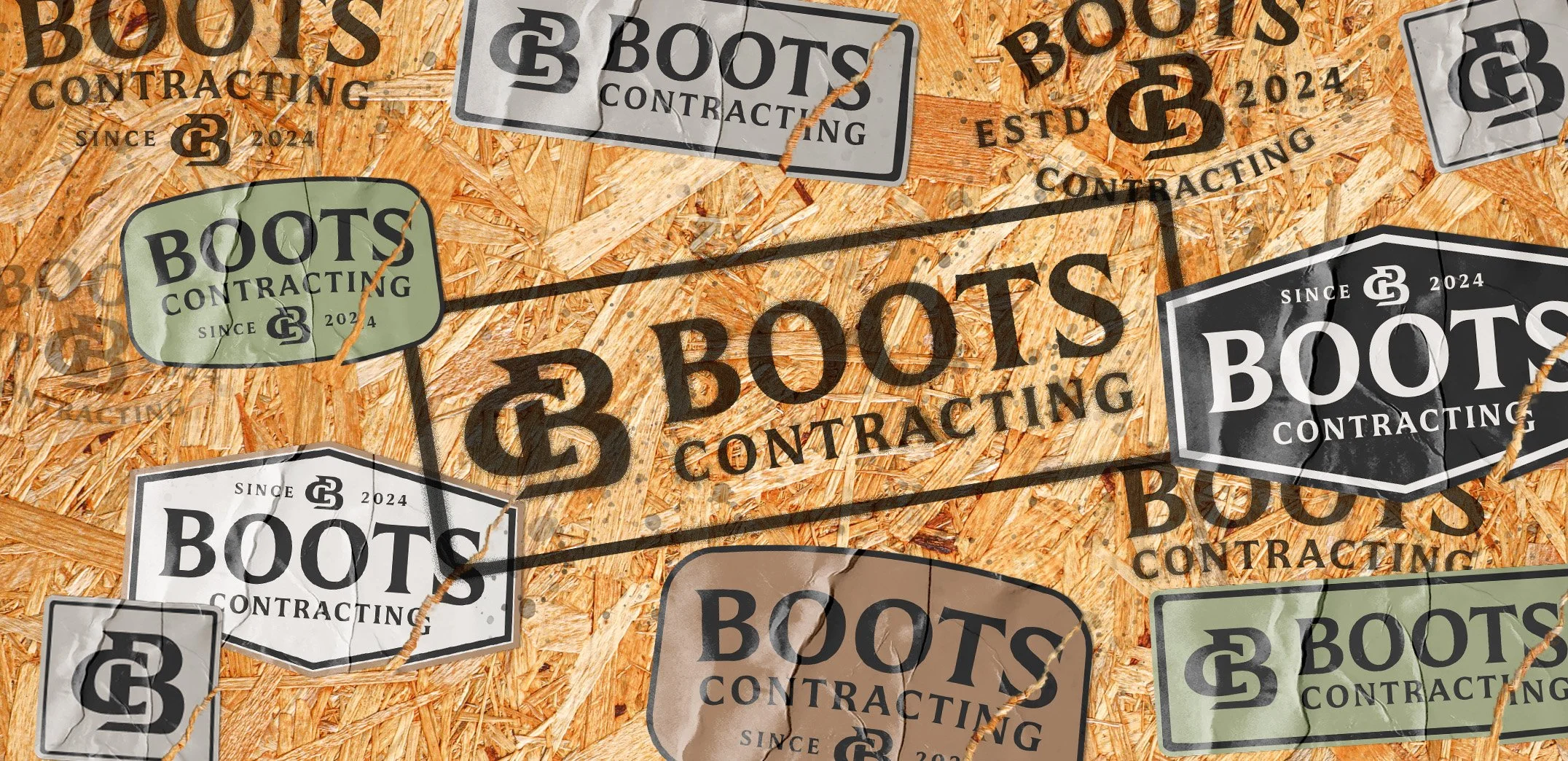
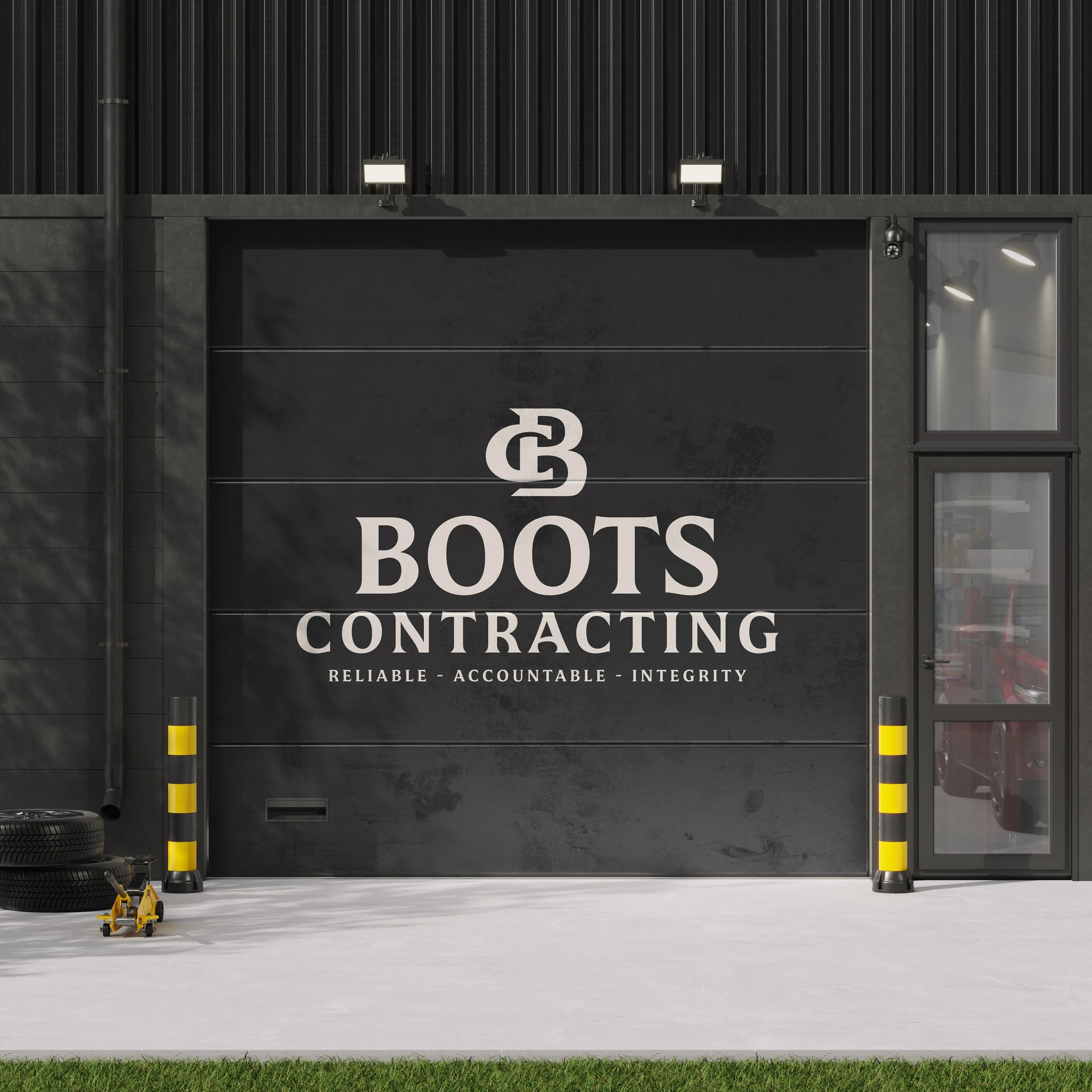
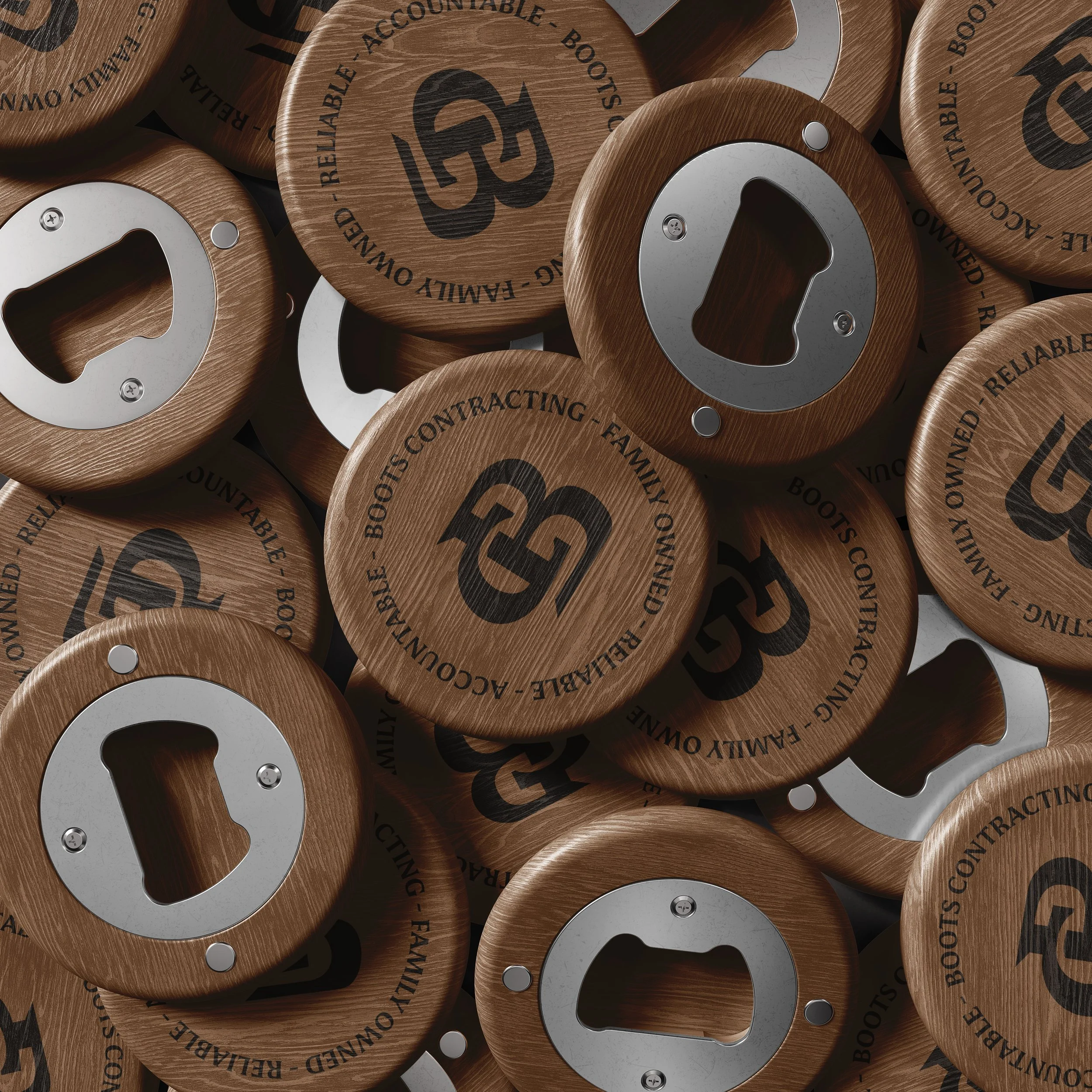
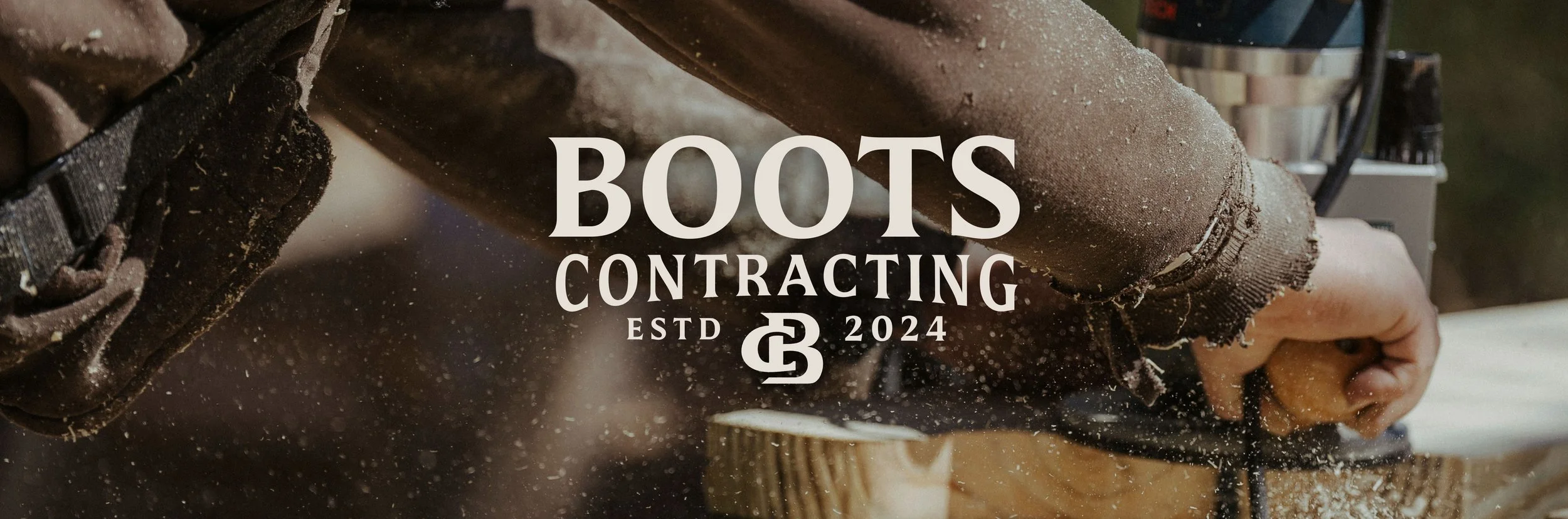
This system needed to work in the real world: on trucks, online, signage, job sites, and paperwork that still holds up years from now.
The approach
The Problem
The result is an identity that finally matches how Boots Contracting operates.
Steady.
Disciplined.
Built on family.
Work you can stand on.
The outcome